
I was very pleased to participate in 2018 Pyeongchang Winter Games Art Poster Competition. As South Korea being my home country, I wanted to make a poster that represents both
Korea’s powerful passion and
winter sport’s dynamic energy.
The ski jumper’s acceleration towards the take-off point and the jumper’s range of flying time seemed metaphorical to Korea’s historical growth.
I asked myself this question numerous times: ‘How can I make both graphic and simplified poster that delivers dynamic movement. I thought that the visual process of ski-jumping represented the energy I was seeking for. For one successful jump, jumpers risk their lives with endless practice. With the jumper’s first successful landing on 70meters stand, his or her worries turn into ‘simplified glory.’

(left to right) The ski jump architecture shows extensive curve that reflects Taeguek’s red and blue conjoining curve.
First sketch shows that lines are directly connected to the jumper. Curved lines that are connected to the jumper successfully represent acceleration.
First vector edition shows scaled up jumper which is composed of geometric shapes. Five Olympic colors are connected to the jumper to show movement.
In the second vector edition, the jumper is scaled down to show balance the snow mountain and the negative space, sky.
Two Taegeuk colors, red and blue, were applied to the composition. The scale of the jumper expresses distinctive meaning to the poster.
Same method was applied to make the second edition, bobsleigh. However, it did not deliver same dynamic movement as the ski jump edition.
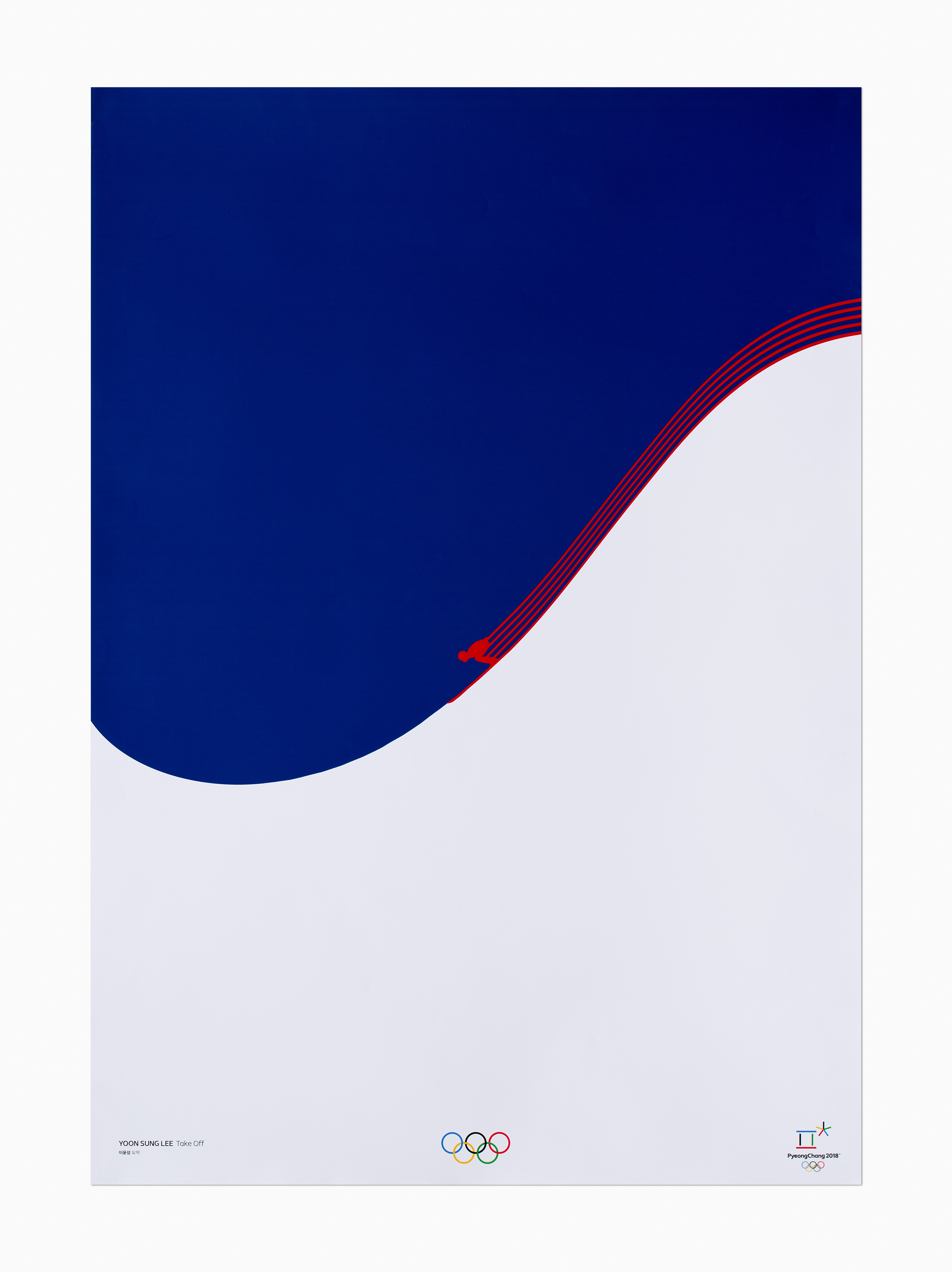

Taegeuk blue was used to represent the winter games’ night sky.
With the ski jumper going down the slope, Taegeuk red was applied to the five lines that follow the jumper.
Five red lines represent five continents where all of athletes are from challenging themselves for the Olympics.