Being in the industry for 64 years, Atec Inc. is a manufacturing company that provides high-quality products and energy services for aerospace companies such as NASA. Atec is a parent company of three subsidiaries: Celtech Corp., Hager Machine & Tool, and Vital Link.
Today, as the aerospace industry grows, numerous projects related to jet propulsion also grow. With this thriving trend, Atec wants to grow its manufacturing size along with a number of future clients. In order to successfully connect with Atec’s potential clients, it is crucial to have progressive ways of communication. One of them is the visual language of the company’s brand value. Let’s take a walk!

Atec’s original logo

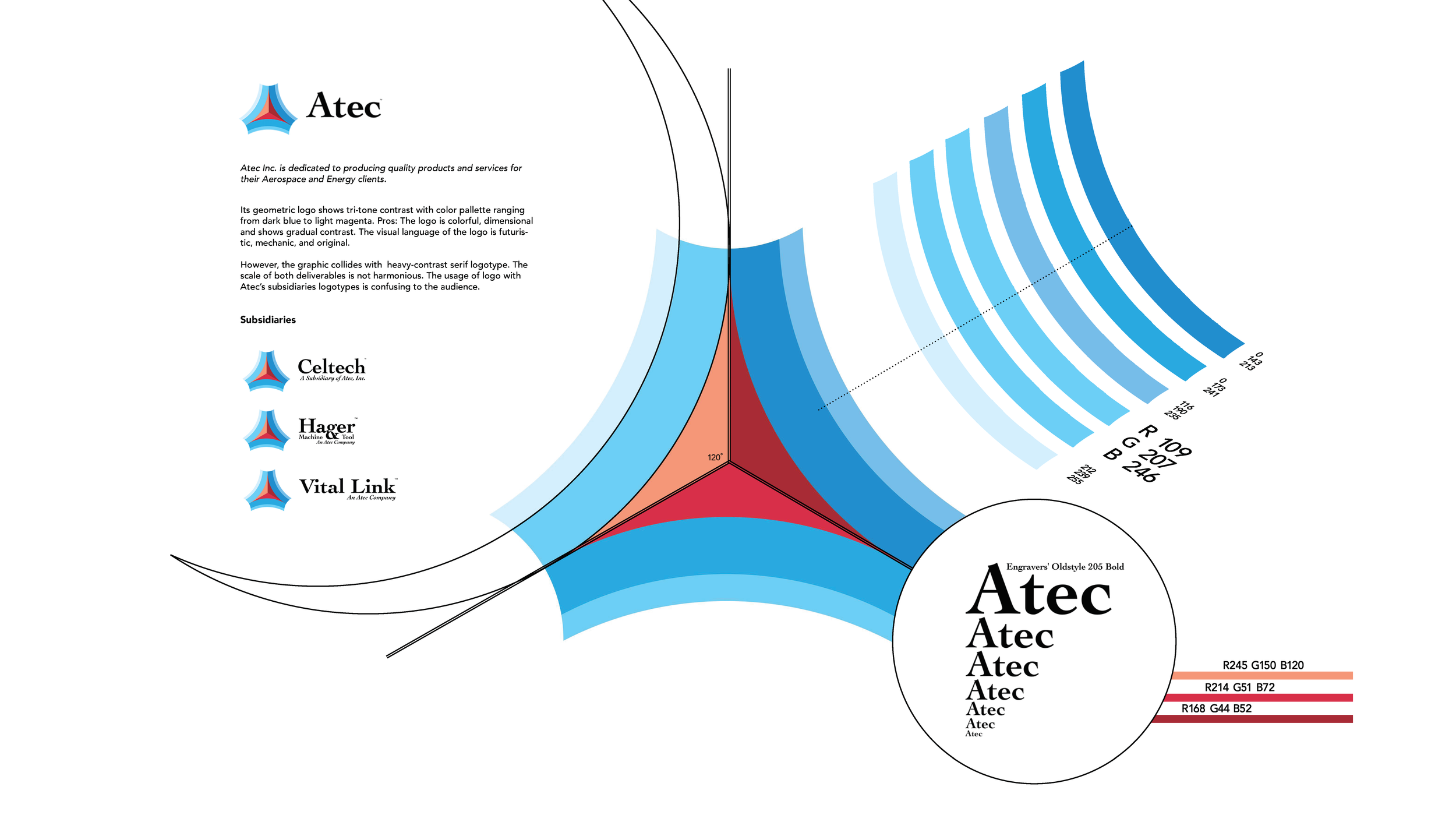
In Atec’s original logo, its geometric shapes show tri-tine contrast with the color palette ranging from dark blue to light magenta. The logo is colorful, vibrant, dimensional and shows gradual contrast. The first impression of this logo is futuristic. However, the logo’s graphic element collides with heavy contrast serif logotypes. The scale of both deliverables is not harmonious. The usage of the main logo along with subsidiaries’ logotypes might be confusing to the audience.
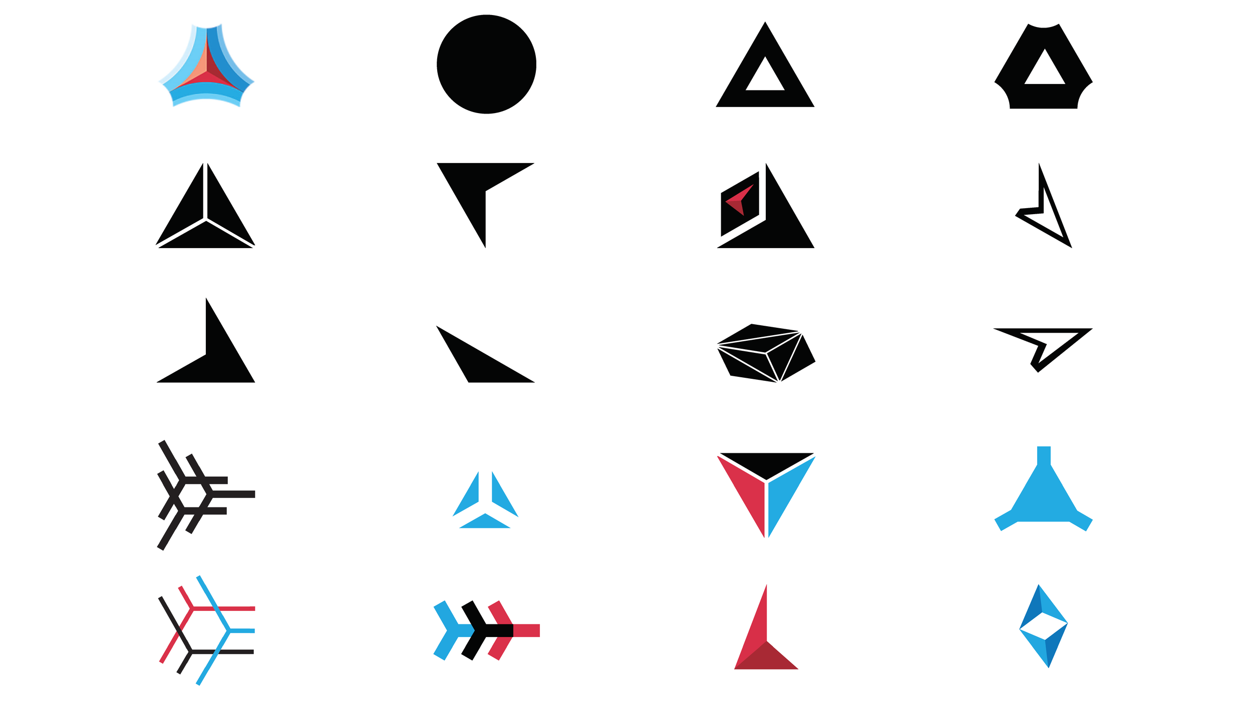
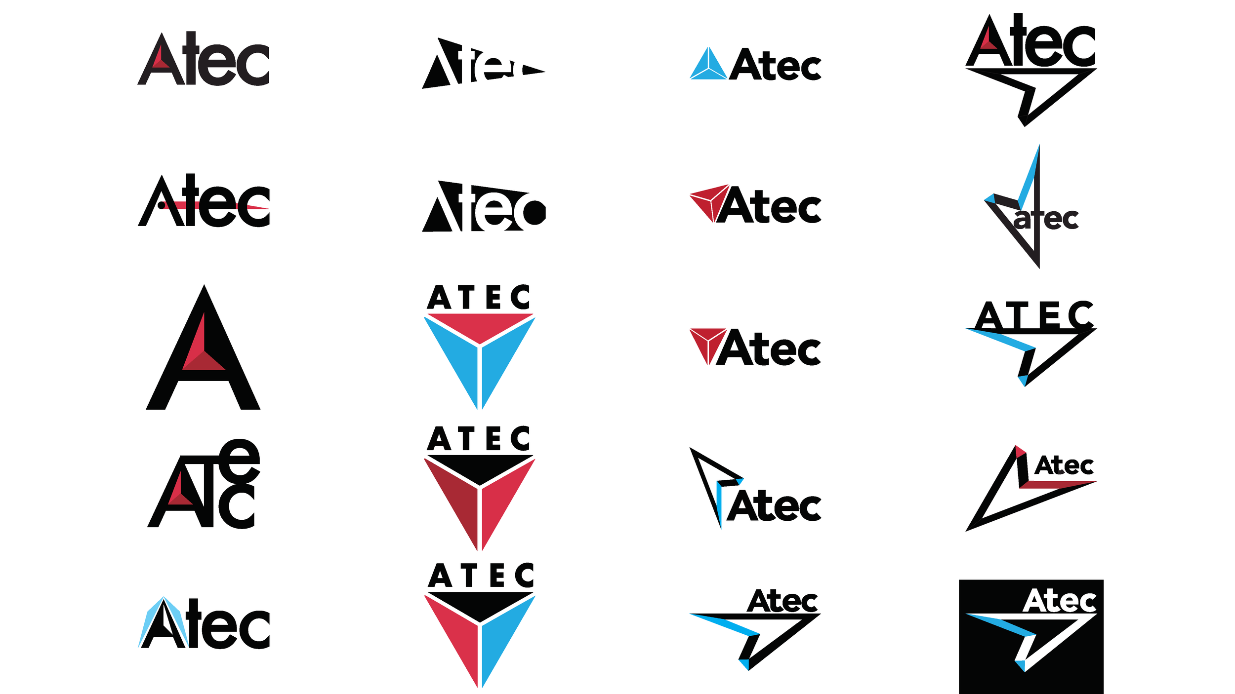
Atec’s New Logo Ideation


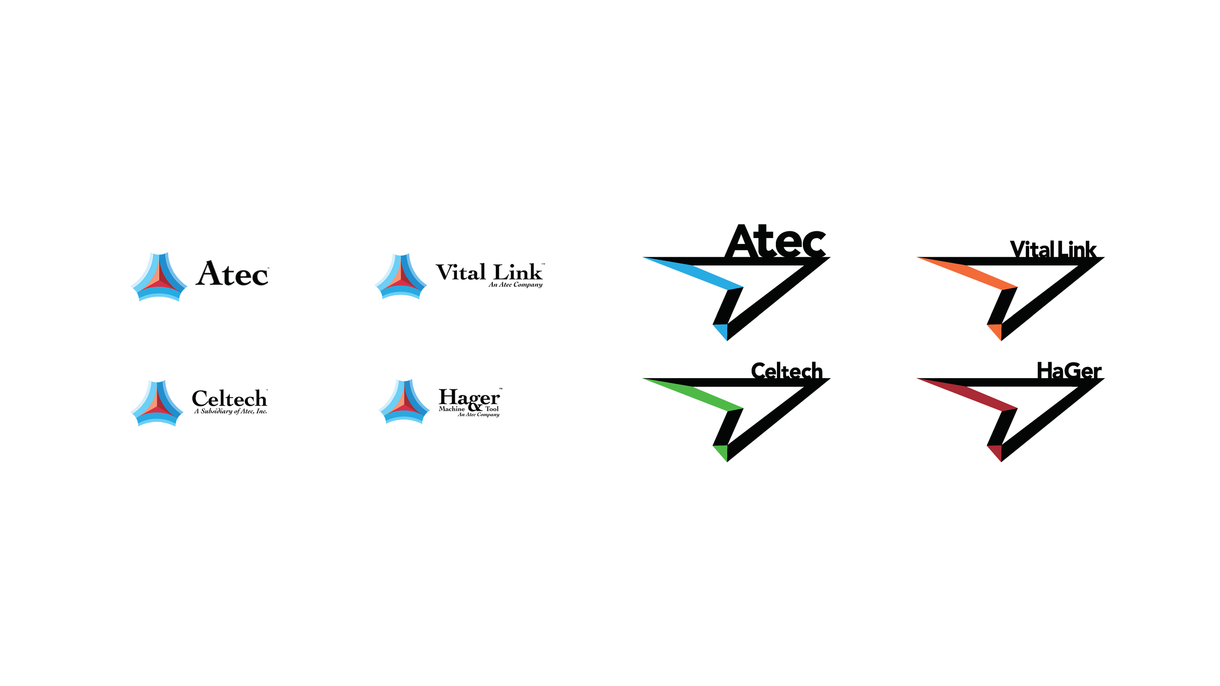


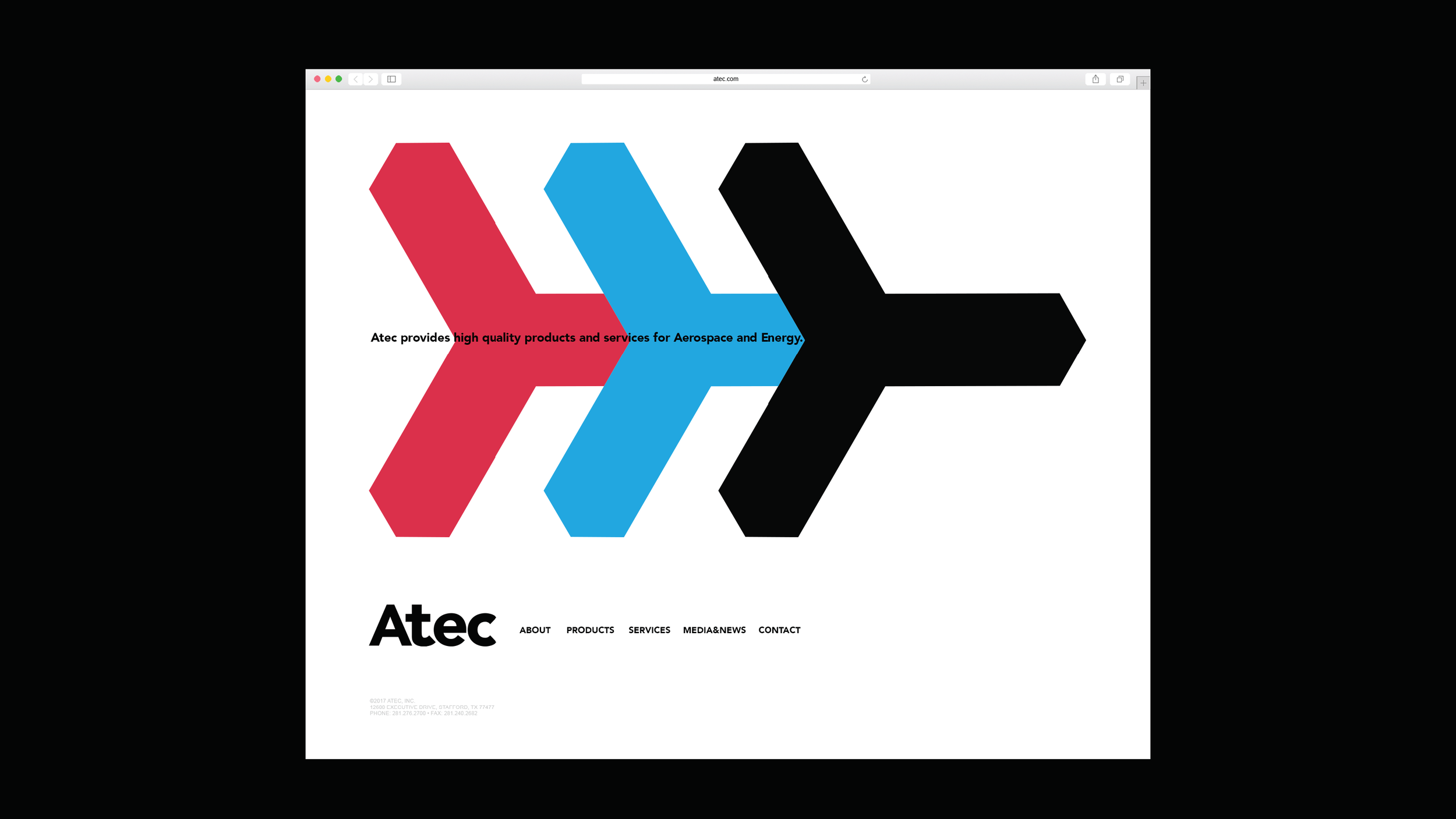
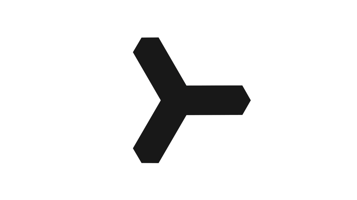
Re-redesigned Atec Inc.

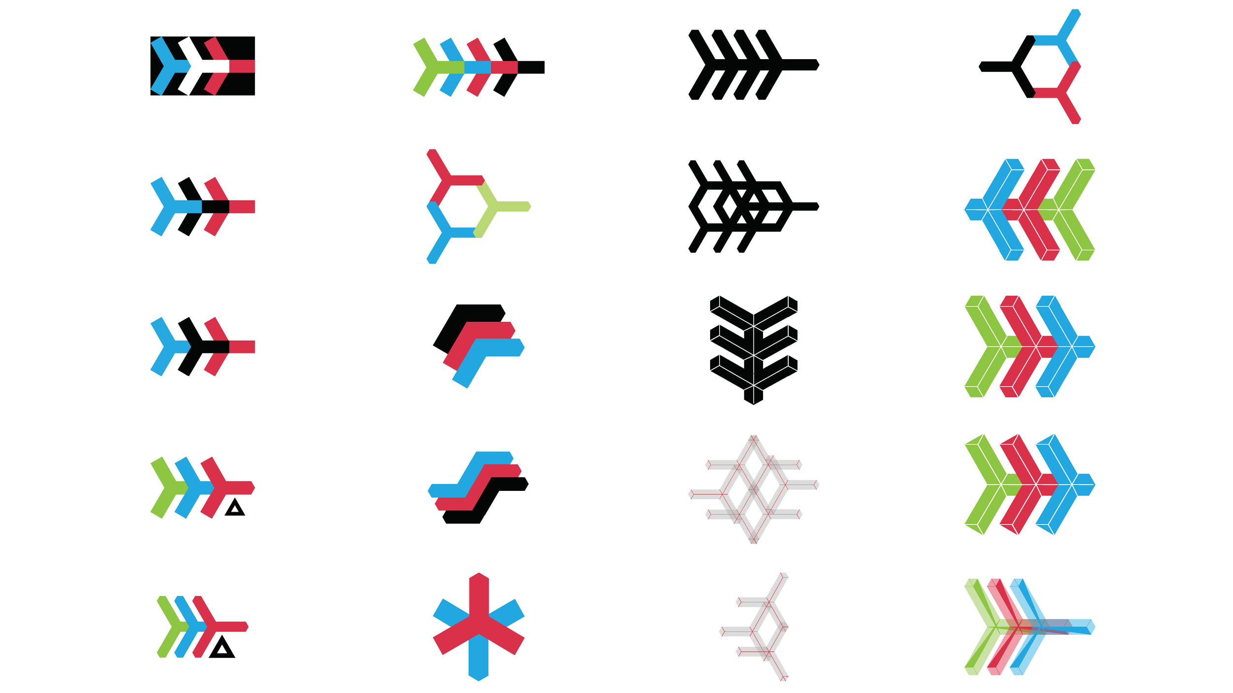

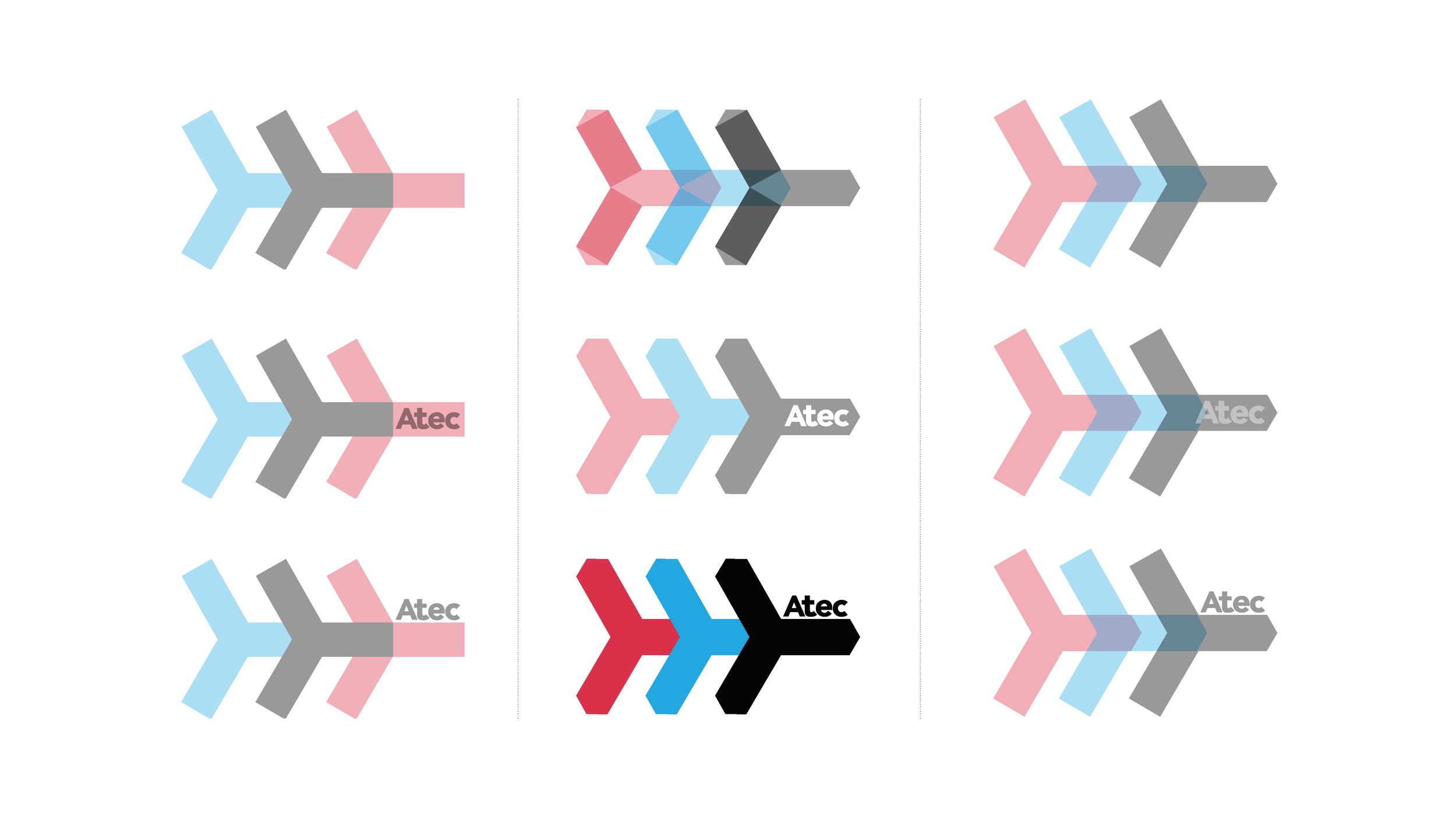
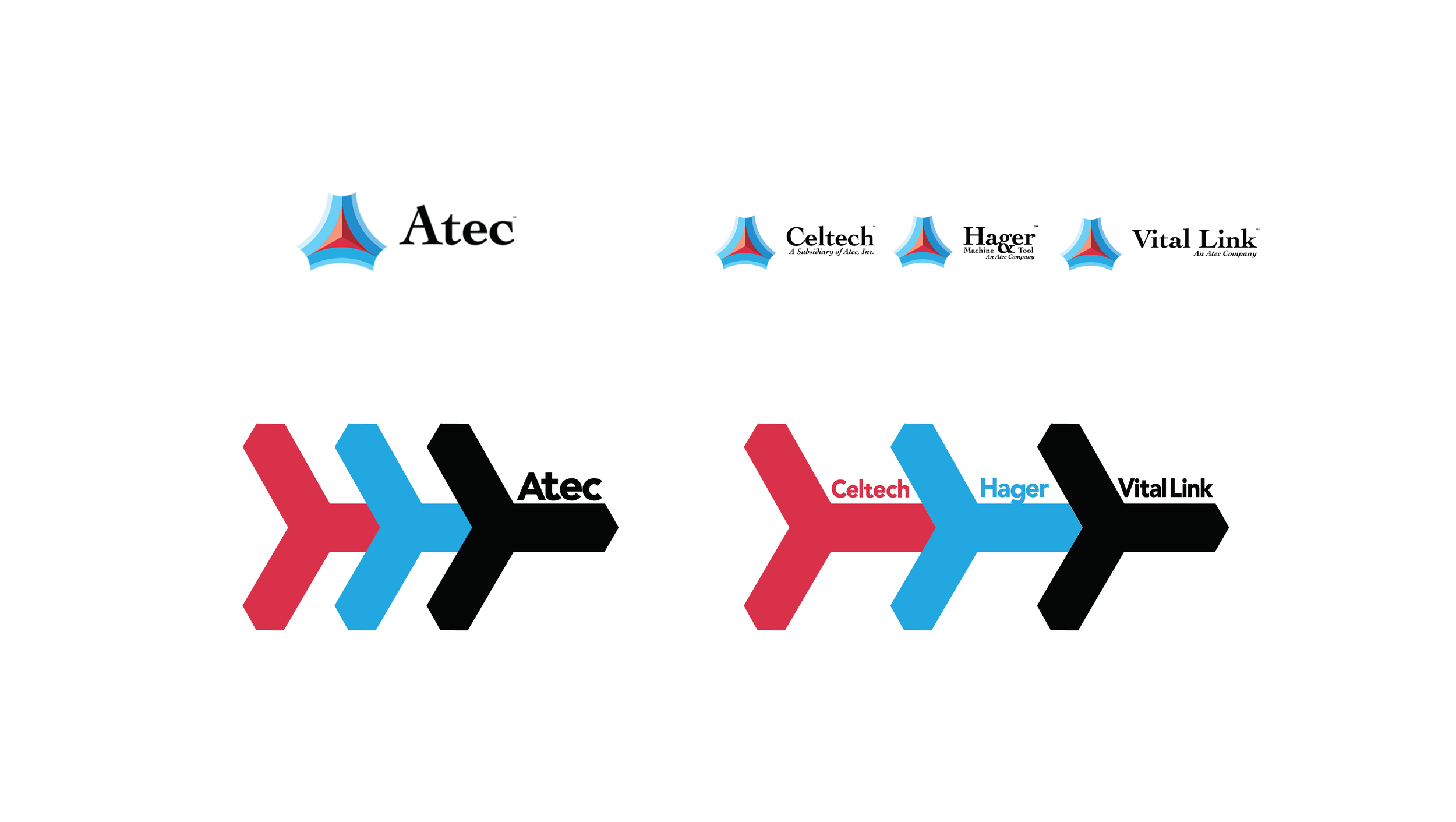

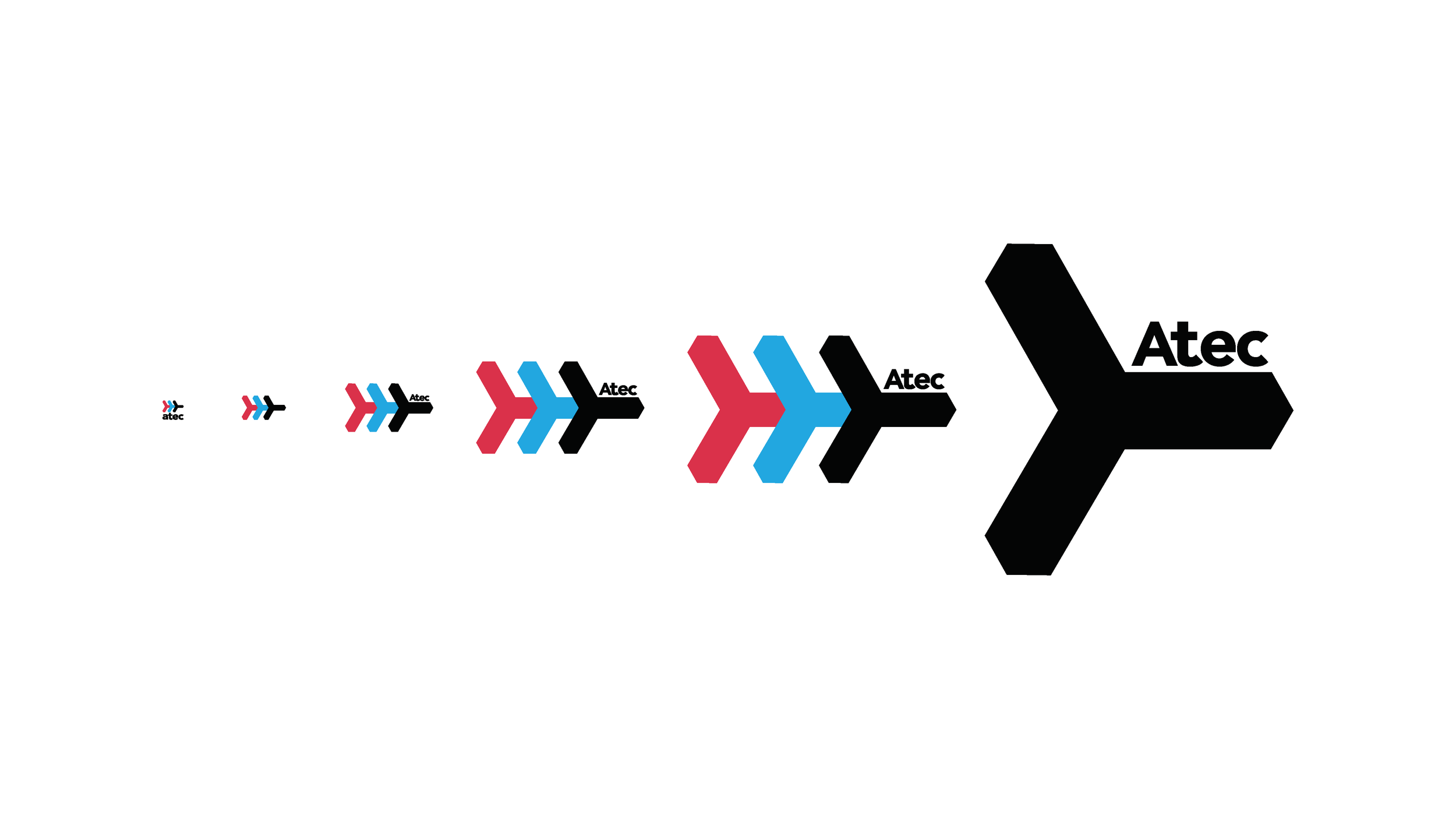
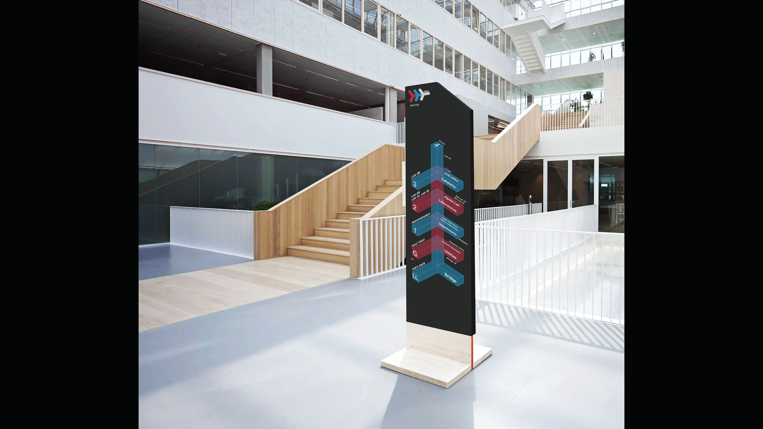
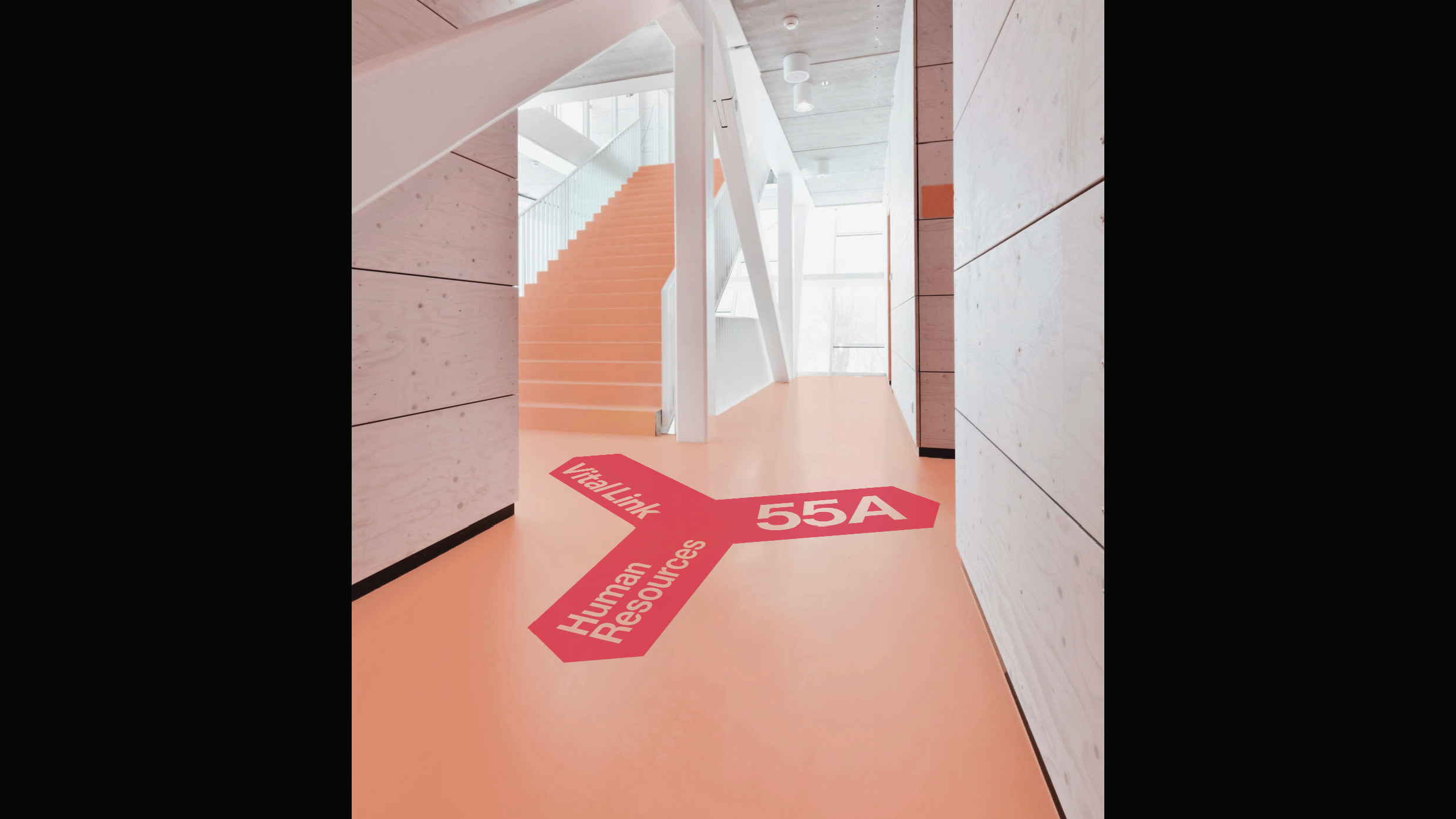
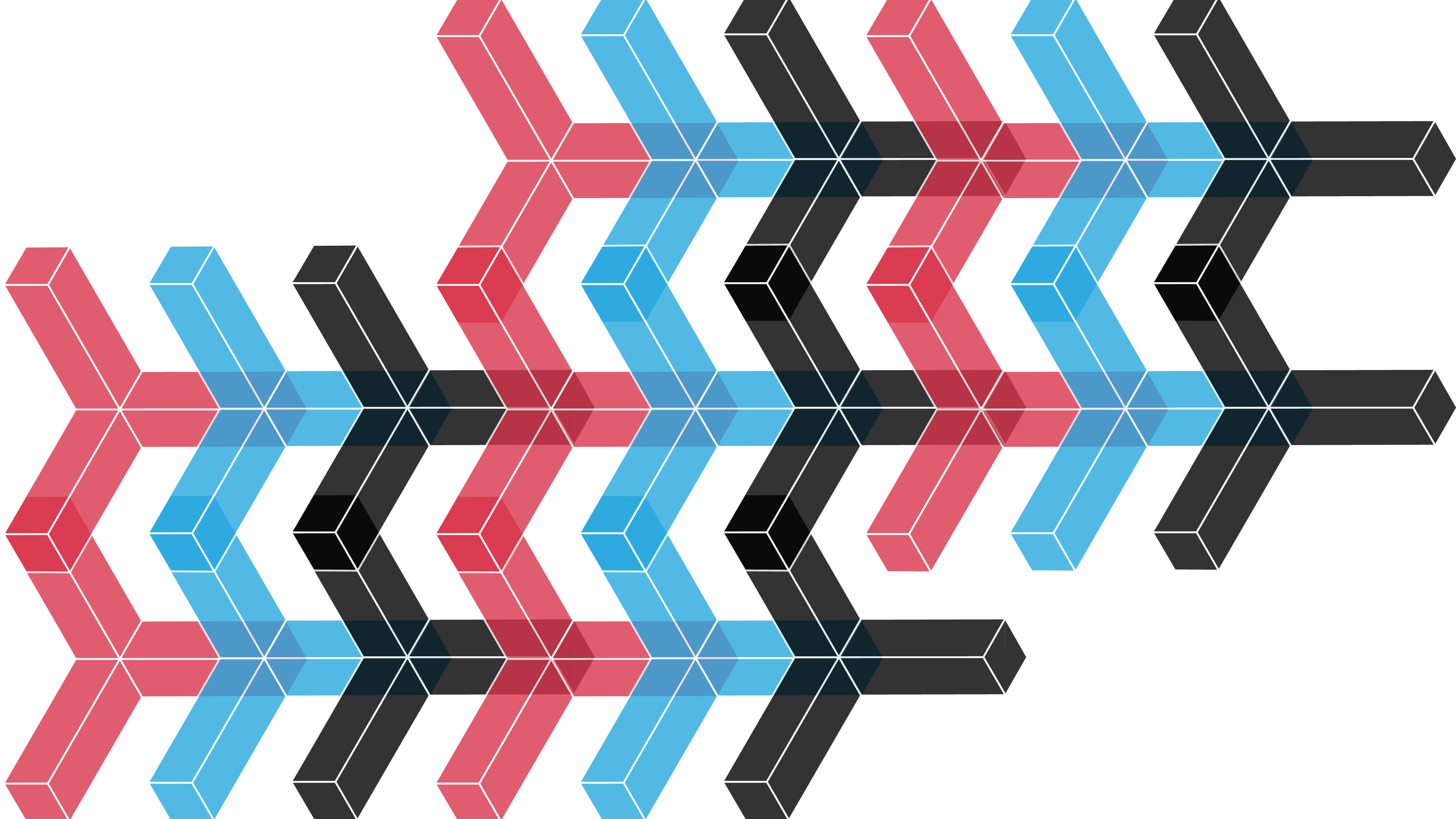
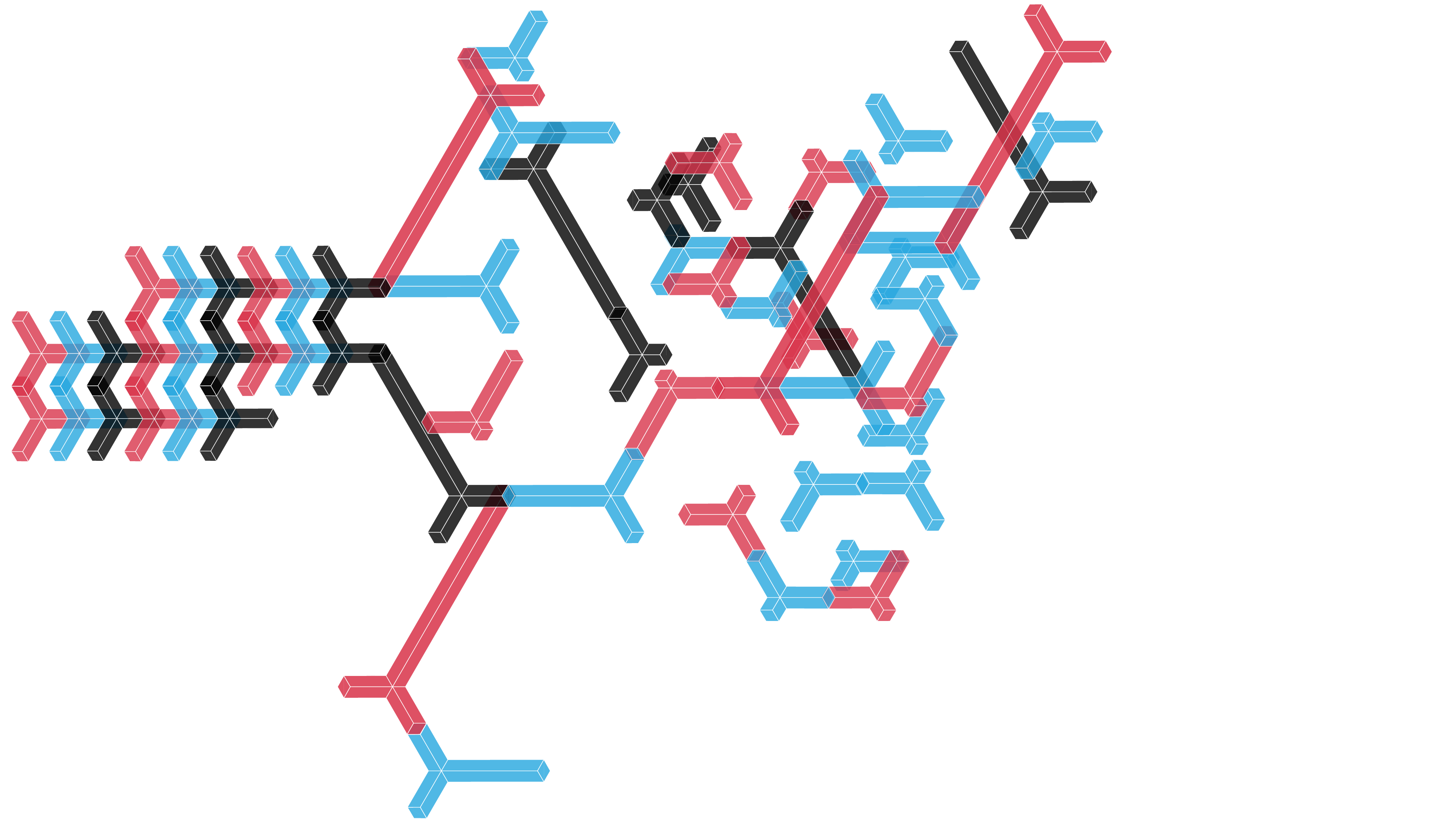
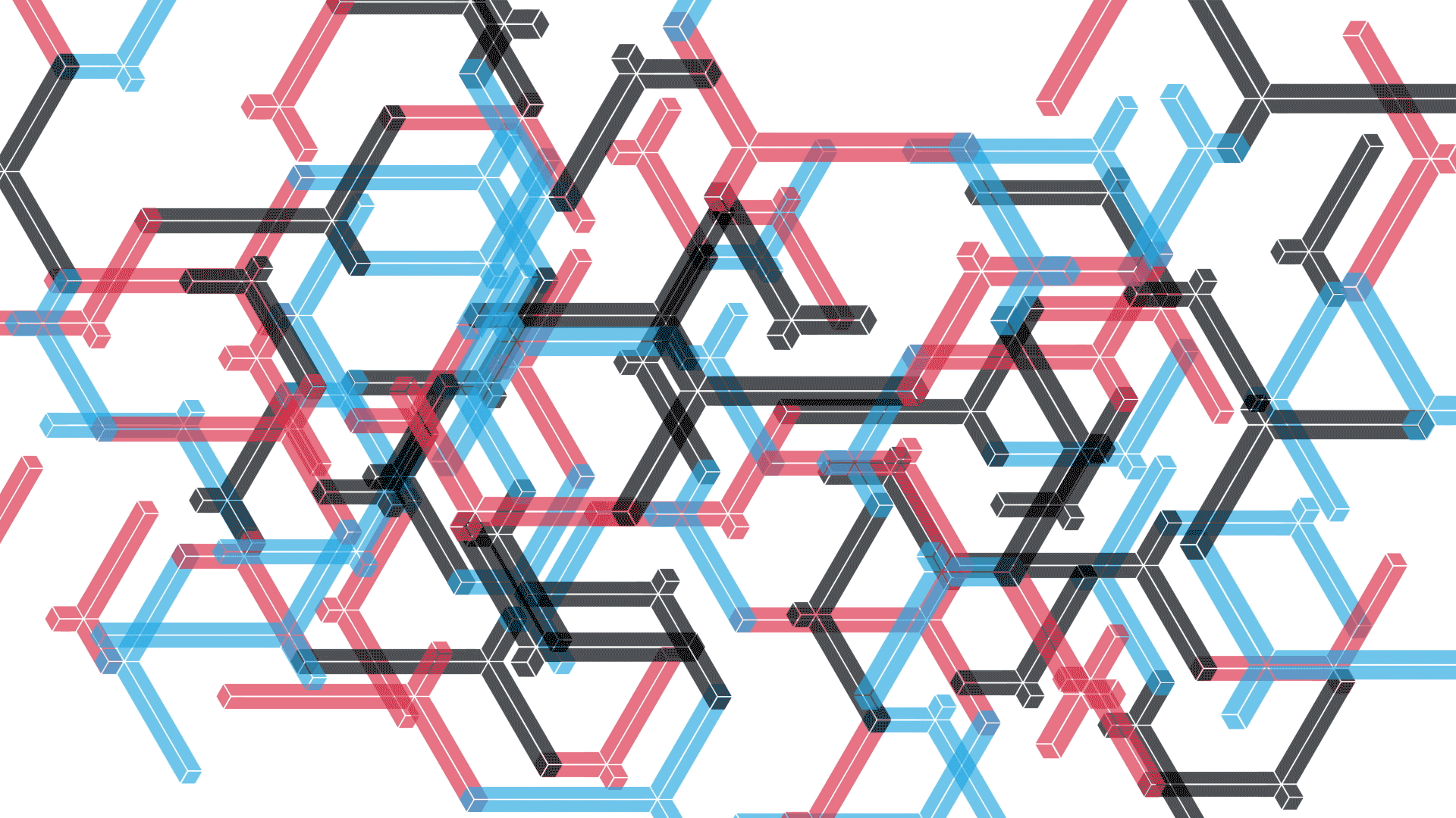
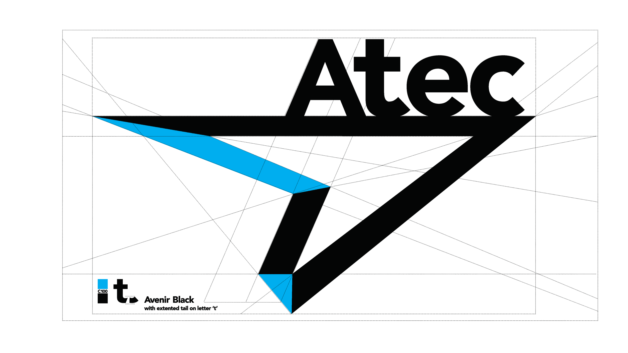
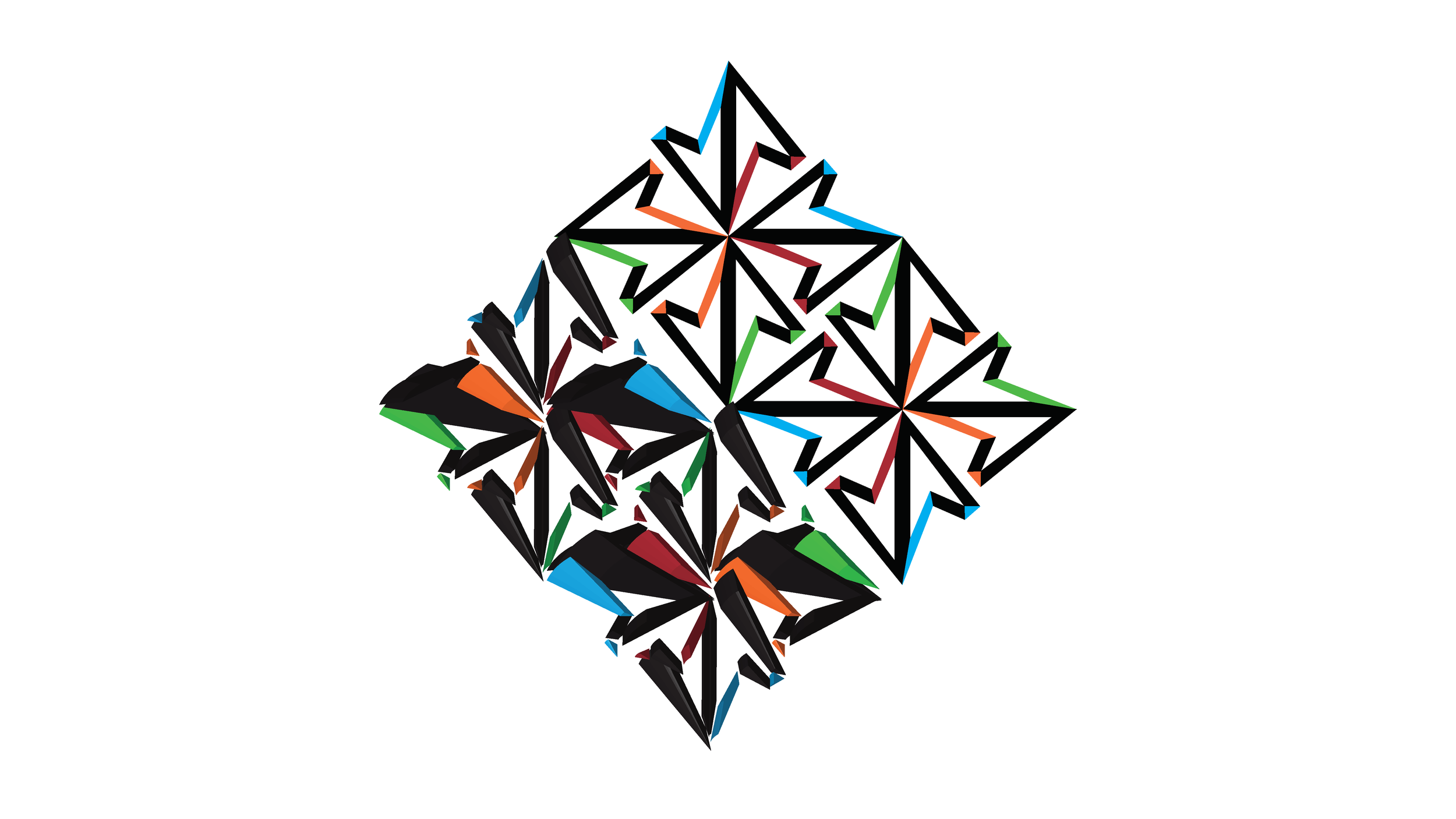
'Simplified' and 'modernized' are the key terms for the logo animation. Atec's newly designed logo includes three major solid colors: black, cyan, and deep magenta. Originating from its old logo, simplified triangle shapes are overlapping to each other. When thinking from logo animation with these symmetrical shapes, one can create interchanging movement.
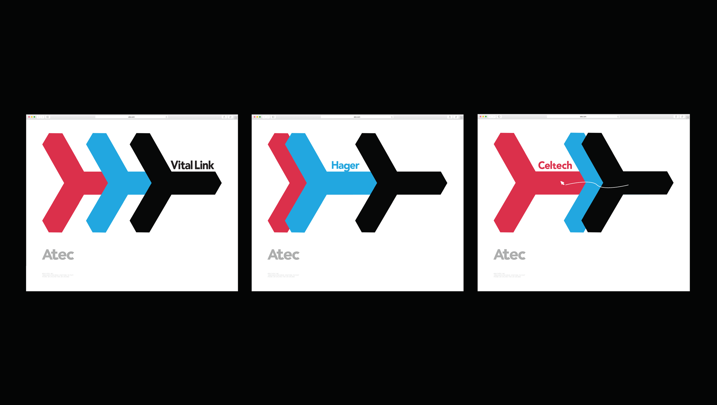
The primary purpose of Atec's logo animation is to show combinative visual interaction among logotypes and logo shapes. The secondary purpose of the animation is a clear visual deliverance of the three subsidiaries' logotypes associating to Atec. The combination of three triangular logos can work as many objectives when animated.
The primary purpose of Atec's logo animation is to show combinative visual interaction among logotypes and logo shapes. The secondary purpose of the animation is a clear visual deliverance of the three subsidiaries' logotypes associating to Atec. The combination of three triangular logos can work as many objectives when animated.