Let’s Scroll︎
Client & internal design work @ Edelman NY / in-house design team
Edelman NY / Public Relations Agency
Edelman’s New York office is home to more than 800 communicators specializing in consumer marketing, corporate and public affairs, digital engagement, health and science communications, financial communications, sports and entertainment marketing and research.
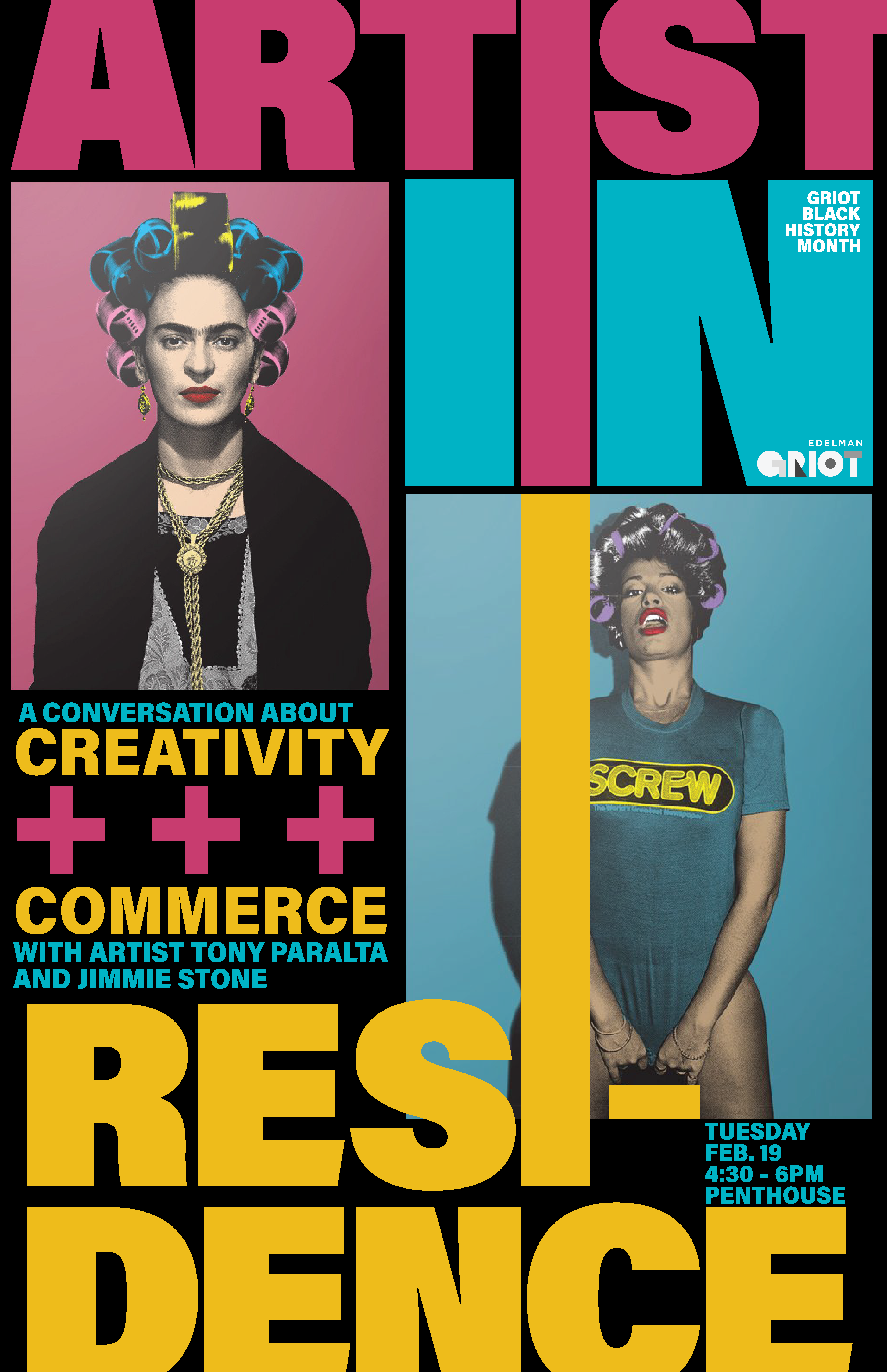
internal event design / microsite / visual system
Edelman’s New York office is home to more than 800 communicators specializing in consumer marketing, corporate and public affairs, digital engagement, health and science communications, financial communications, sports and entertainment marketing and research.
internal event design / microsite / visual system


Freelancing work with Piderit & Partners
Milken Institute / Non-Profit
The Milken Institute is a nonprofit, nonpartisan think tank that helps people build meaningful lives, in which they can experience health and well-being, pursue effective education and gainful employment, and access the resources required to create ever-expanding opportunities for themselves and their broader communities.
The new grid logo is designed by Richard Mehl, my long-time mentor, and the task was to come up with variations of logo animation. When Michael Milken watched one of the logo animations, he mentioned how he found letter M and I within the grid in white lines. Therefore, the final rebranded Milken Institue logo includes a strong white stroke accent in letter M and I.
branding / logo animation / infographic

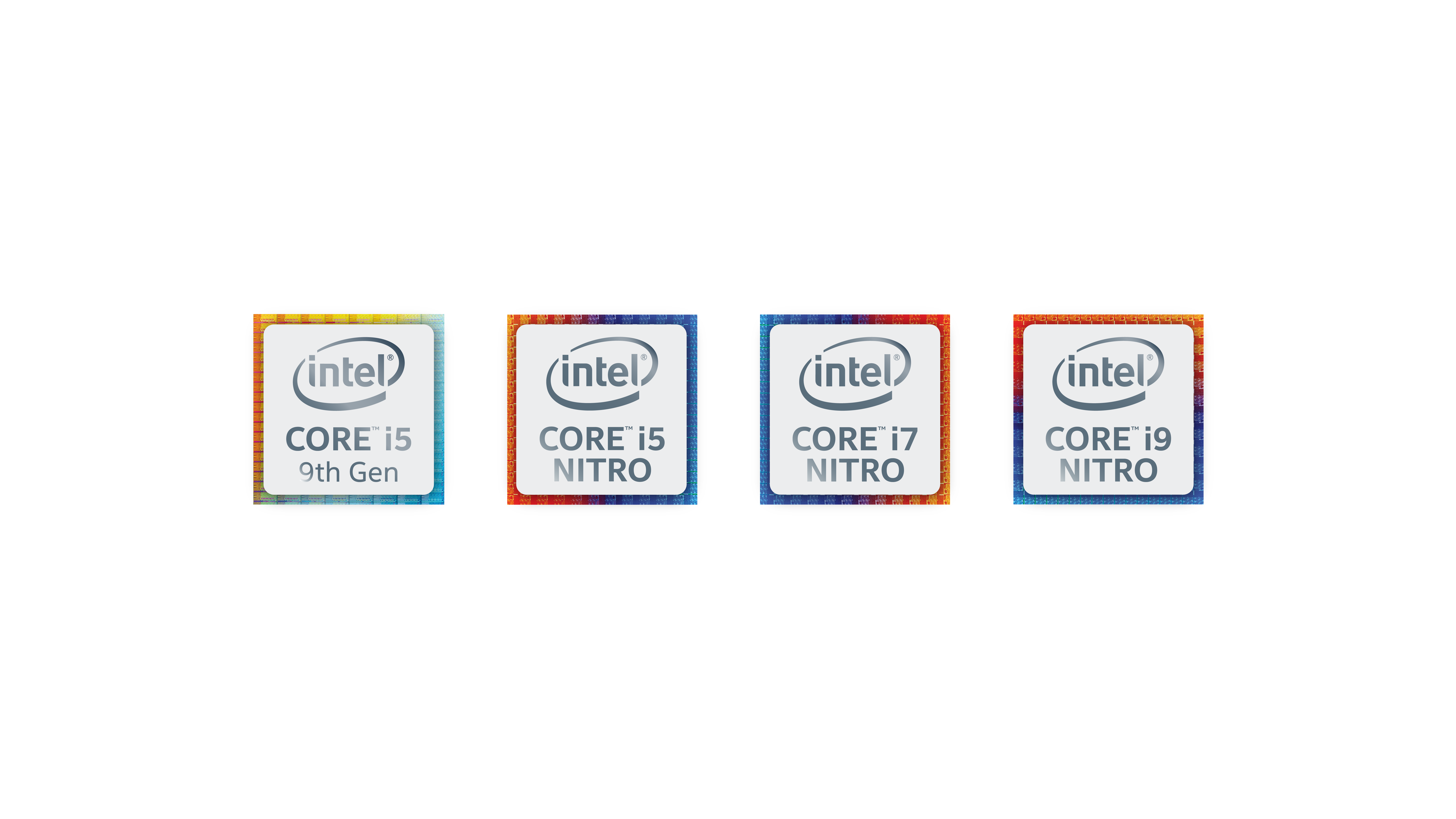
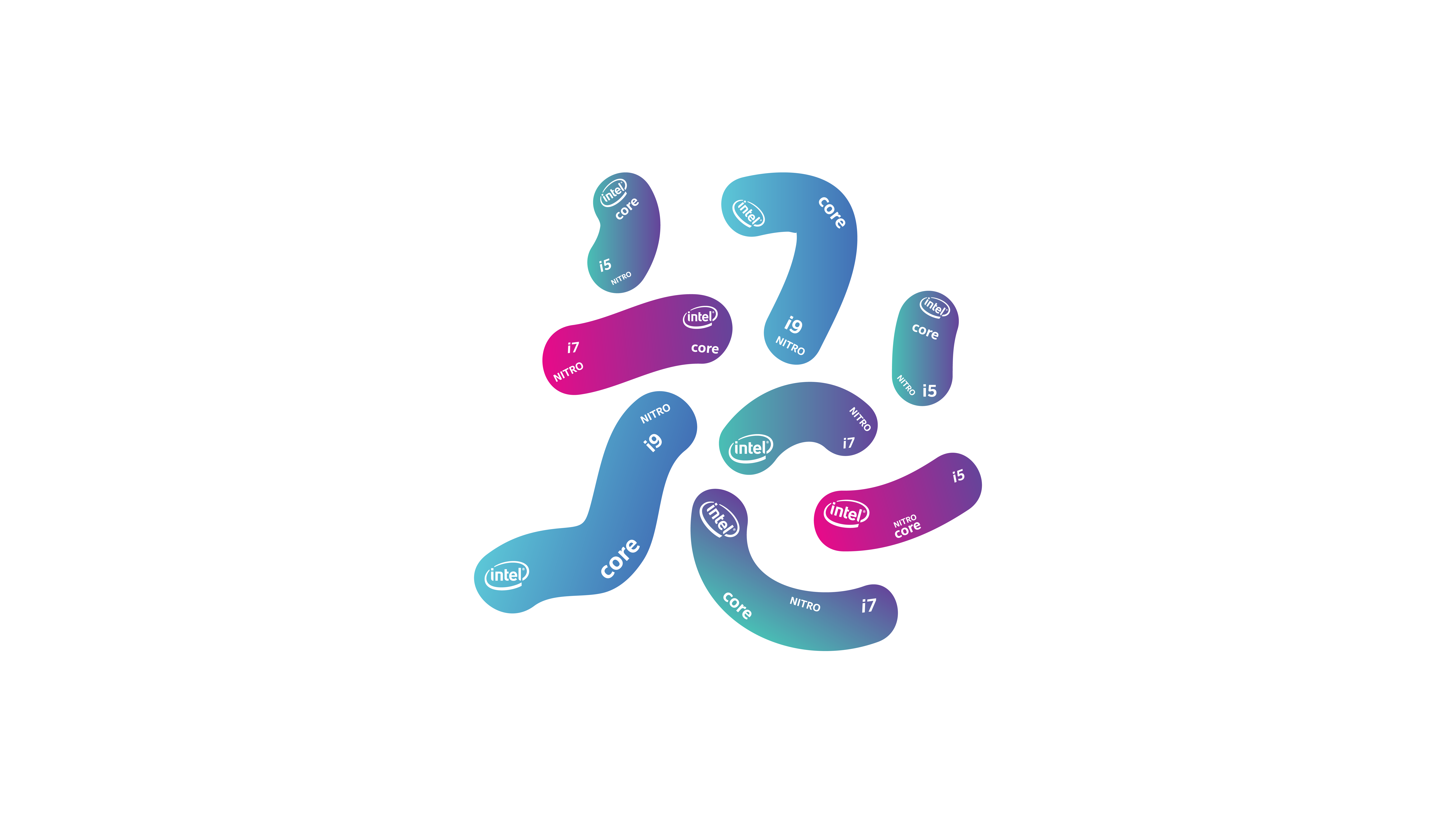
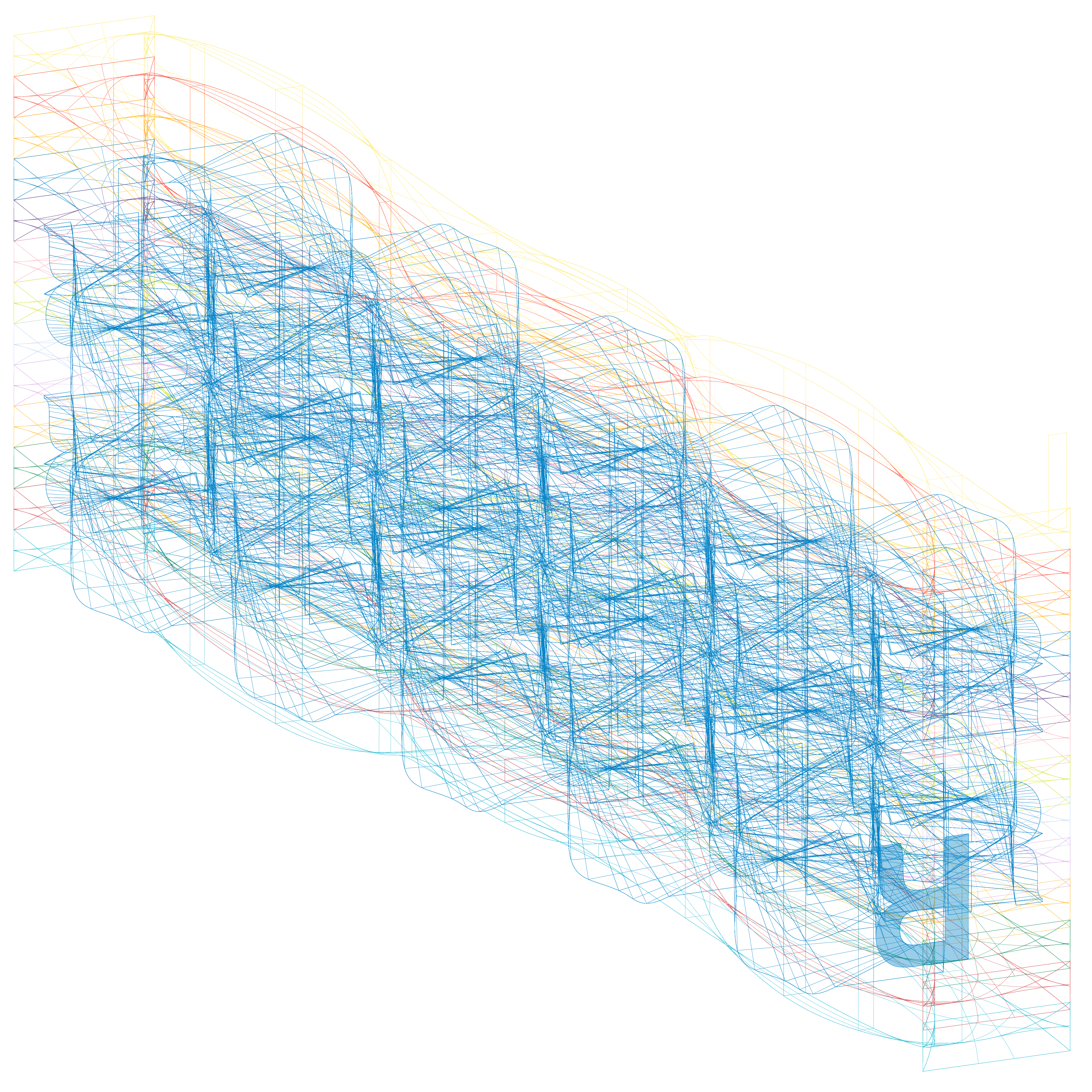
Intel Core 9th / Branding Studio
Coffee Lake is Intel's codename for the second 14 nm process node refinement following Broadwell, Skylake, and Kaby Lake.
The goal of this project was to come up with new Intel's Coffee Lake 9th generation sticker design. This 0.7”x0.7” sticker gets sealed on almost every window operated laptop. The sticker design exploration ranged from rectangular wafer textures to gradient organic worm shapes.
Although Intel ended up choosing a similar design that was used in previous generations, we at lease showed them other creative possibilities.
sticker design / packaging design


Internship @ George Tscherny Inc.
George Tscherny / Designer
mentorship / basics of graphic design
From 2016 May to 2017 May, I was fortunate to be an assistant to George Tscherny. George taught me unforgettable fundementals in graphic design.
Ranging from using X-Acto knife to prototyping through image transfer, George showed me how a designer should always pay attention to details.
Everytime I walked down to a stiff staircase to the basement of his office, I saw and felt his life long works of graphic design ranging from an envelope design to a wall size posters. The entire basement filled with cardboard boxes each labeled and neatly organized dating back to 1951. I saw the evidence of an artist being true to his expression throughout his life. From this experience, I always remind myself to continue being true to myself and my work.
mentorship / basics of graphic design

Branding Exploration @ SVA / Pentagram - Paula Scher & Courtney Gooch
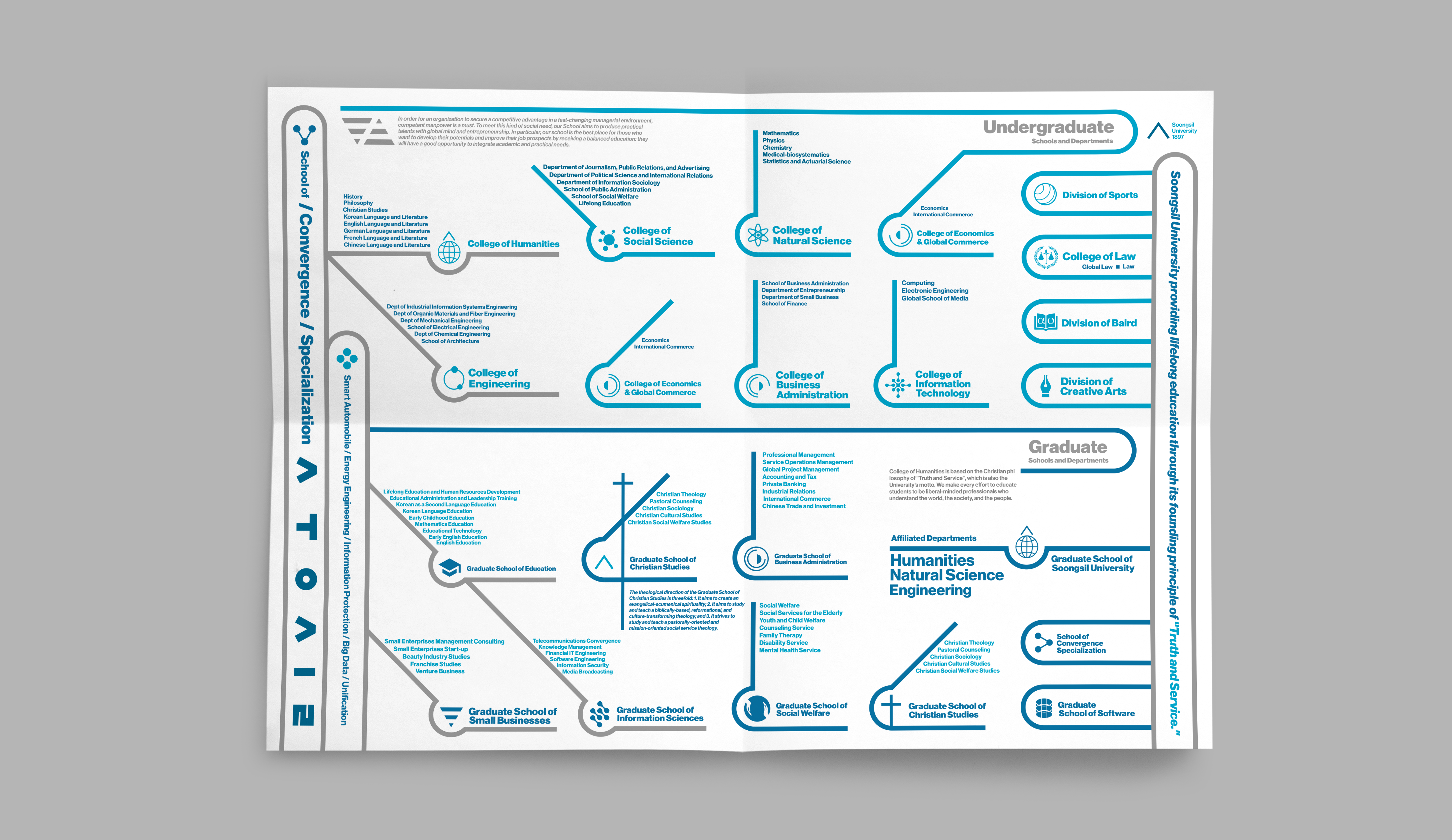
Soongsil University / Education
Soongsil University was founded by CHristian missionaries in Pyongyang in 1897 and became the first four-year college in Korea in 1905. After closing down for 16 years in protest of colonial oppression by the Japanese, Soongsil was re-established in Seoul in 1954. For over a century since its foundation, Soongsil has had an ongoing mission of contributing to society through education and research to the highest degrees of excellence.The purpose was to reconstruct Soongsil University’s identity.
branding / product design


Branding Exploration @ SVA / Pentagram - Paula Scher & Courtney Gooch
Ny Glyptotek / Museum
Marble statues and masterpieces, mummies and Mediterranean moods. With its unique blend of art and magnificent architecture, Glyptoteket is a place for active contemplation and quiet repose. The world-class collection of art and antiquities continues to offer new perspectives on human existence, culture and civilization as seen through 6.000 years of art. Ny Glyptotek is located in Copenhagen, Denmark.
grid system / typography / wayfinding


Branding Exploration @ SVA / Pentagram - Paula Scher & Courtney Gooch
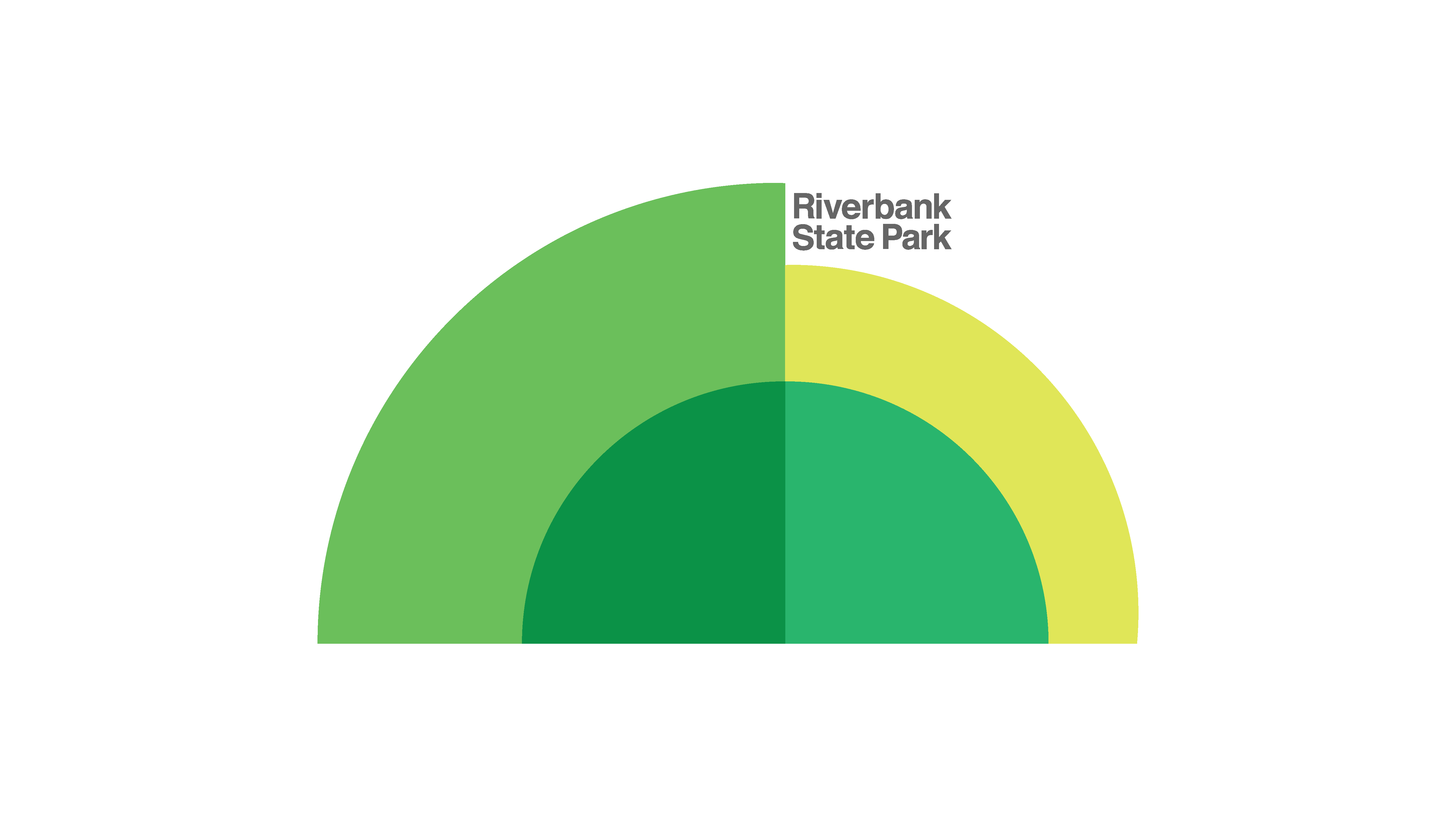
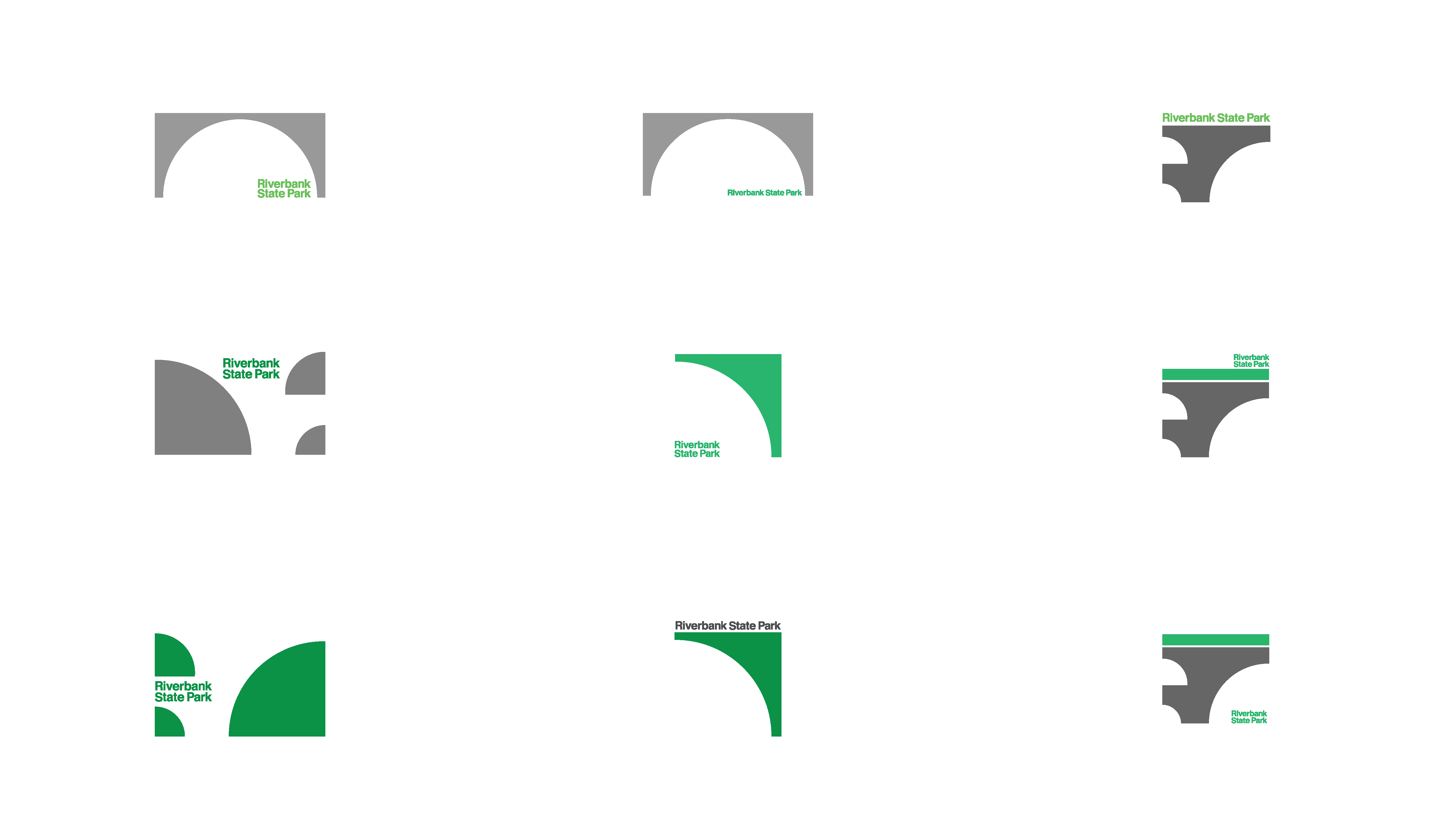
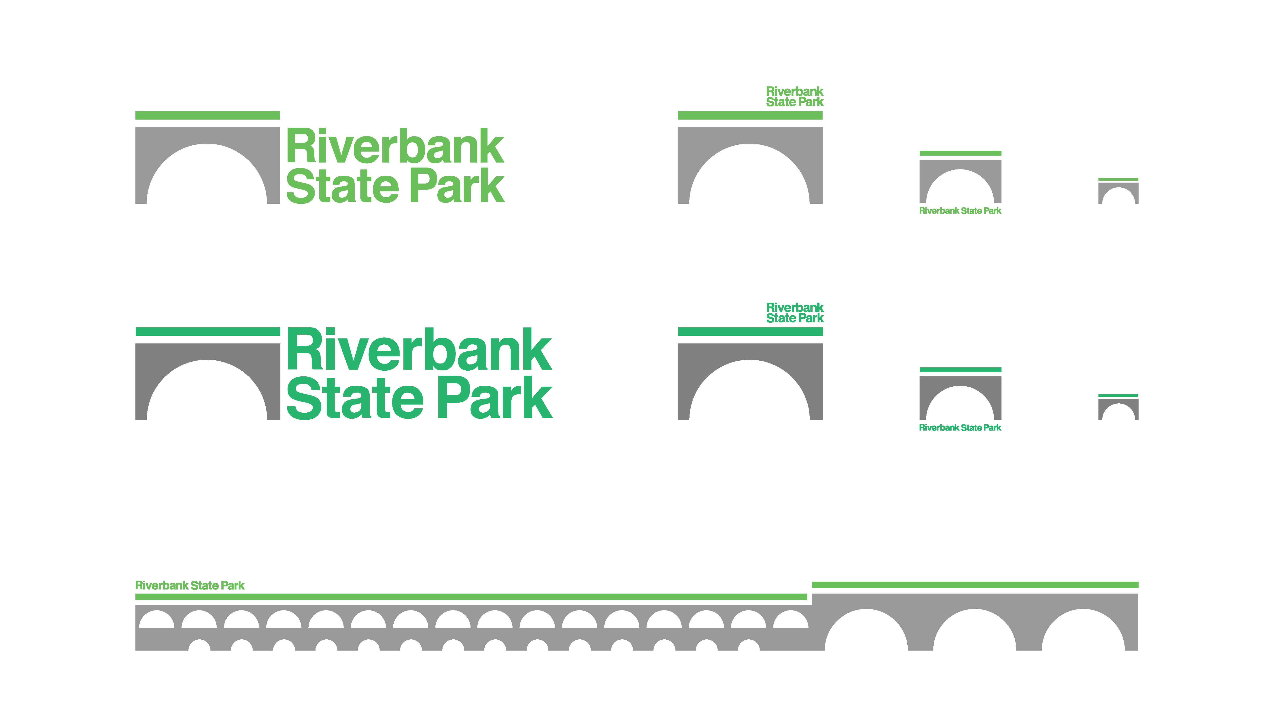
Riverbank State Park / Public Park
Riverbank State Park identity rebranding.
branding / wayfinding / installation
Riverbank State Park identity rebranding.
branding / wayfinding / installation
Branding Exploration @ SVA / Pentagram - Paula Scher & Courtney Gooch
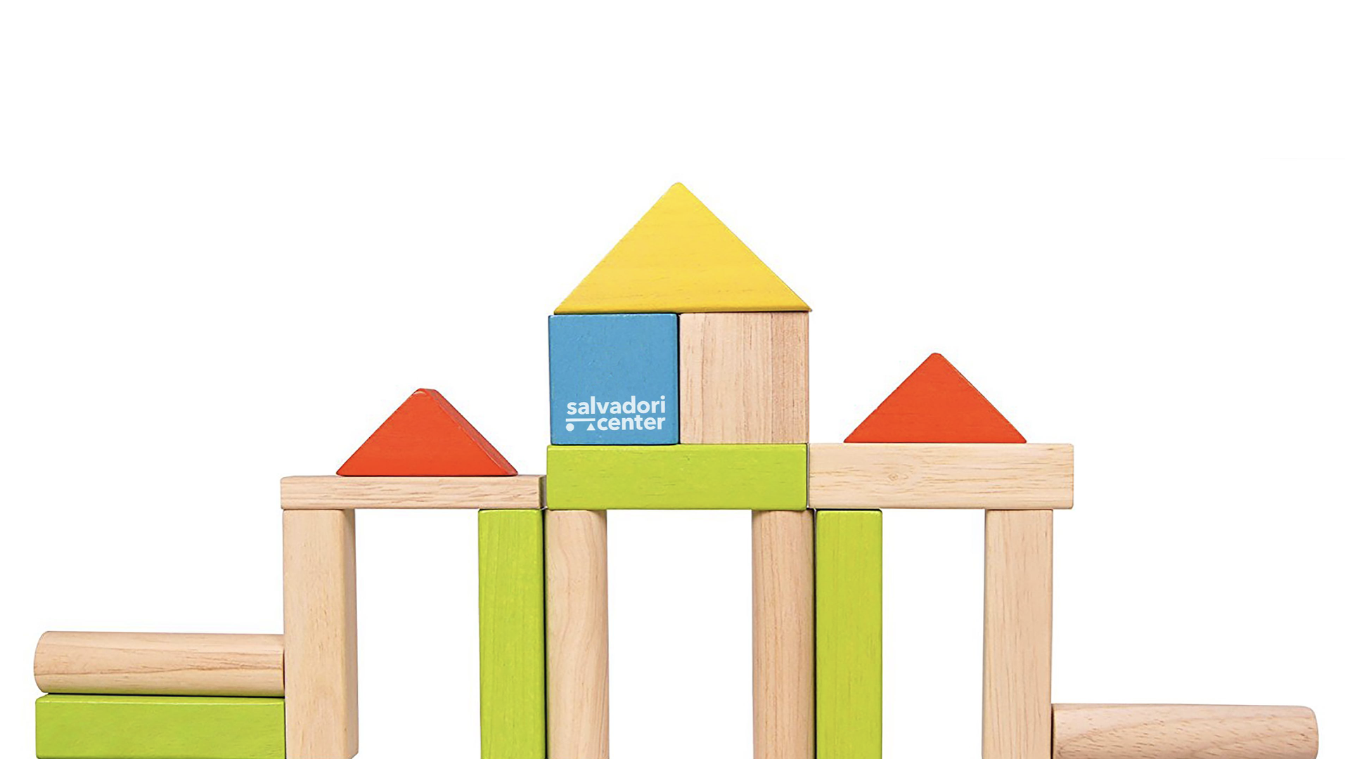
Salvadori Cener / Non-Profit Organization
Mario Salvadori was a structural engineer and professor of both civil engineering and architecture at Columbia University.
As he reached retirement age, Salvadori began volunteering to work with under-privileged minority students from inner-city New York public schools. Developing a hands-on method of teaching kids about the built environment, he was able to reach out to thousands of students and teachers, giving them an appreciation of the usefulness of mathematics and science.
In 1987 he founded the Salvadori Center, a non-profit organization in the Upper West Side of Manhattan, which aims to show students the relevance of math and science using the buildings, bridges, landmarks, and parks in their local communities.
branding / logo animation


Branding Exploration @ SVA / Pentagram - Paula Scher & Courtney Gooch
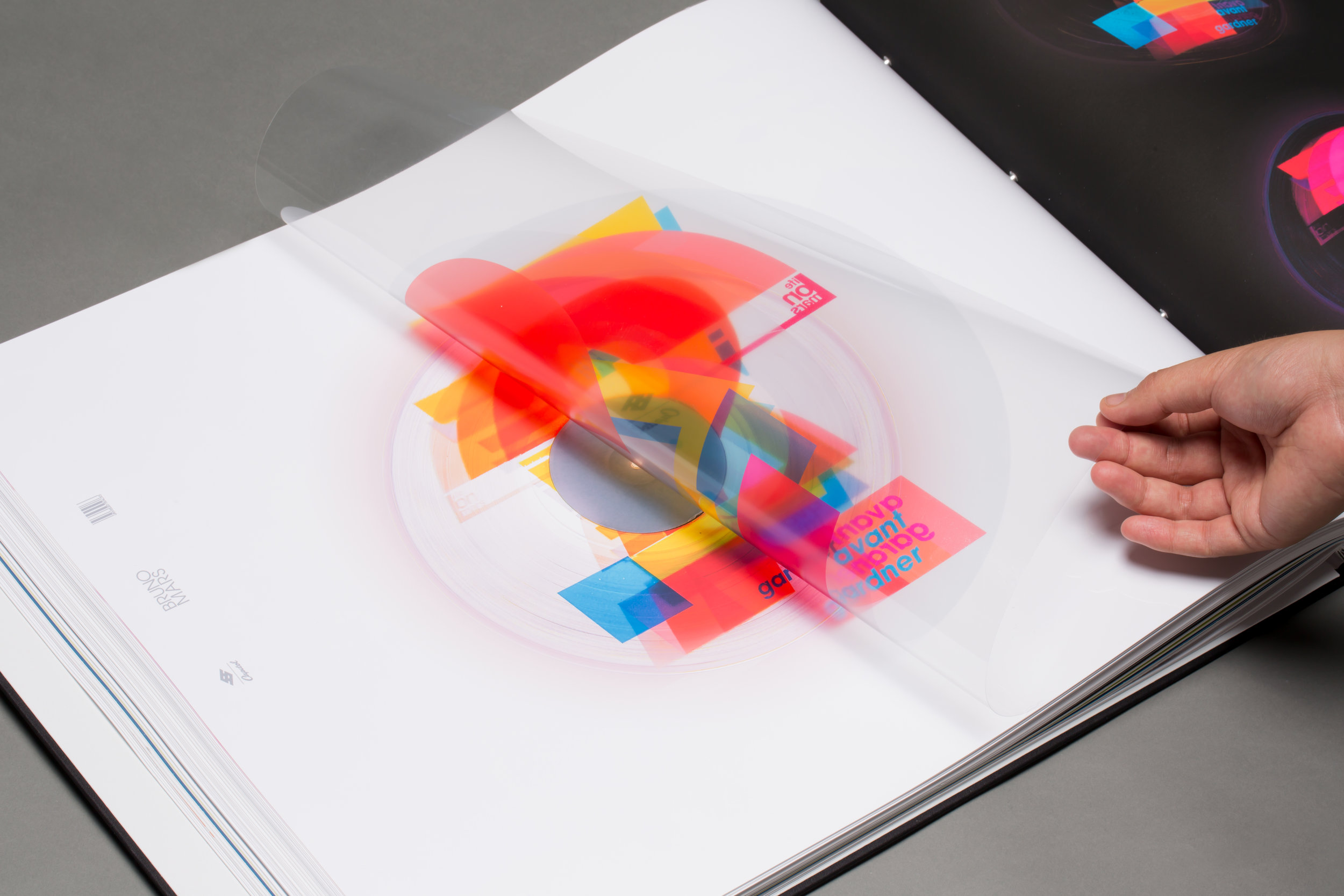
COLORS x 55HAUS / Record Label
Purely experimental typography project. The purpose of the project was to rebrand a music label company. However, during the process of style exploration for the Youtube music platform, COLORS, I asked my self this question: what if each Helvetica characters had its own sounds? I went bananas on this question.
experimental / typography

Branding Exploration @ SVA / Pentagram - Paula Scher & Courtney Gooch
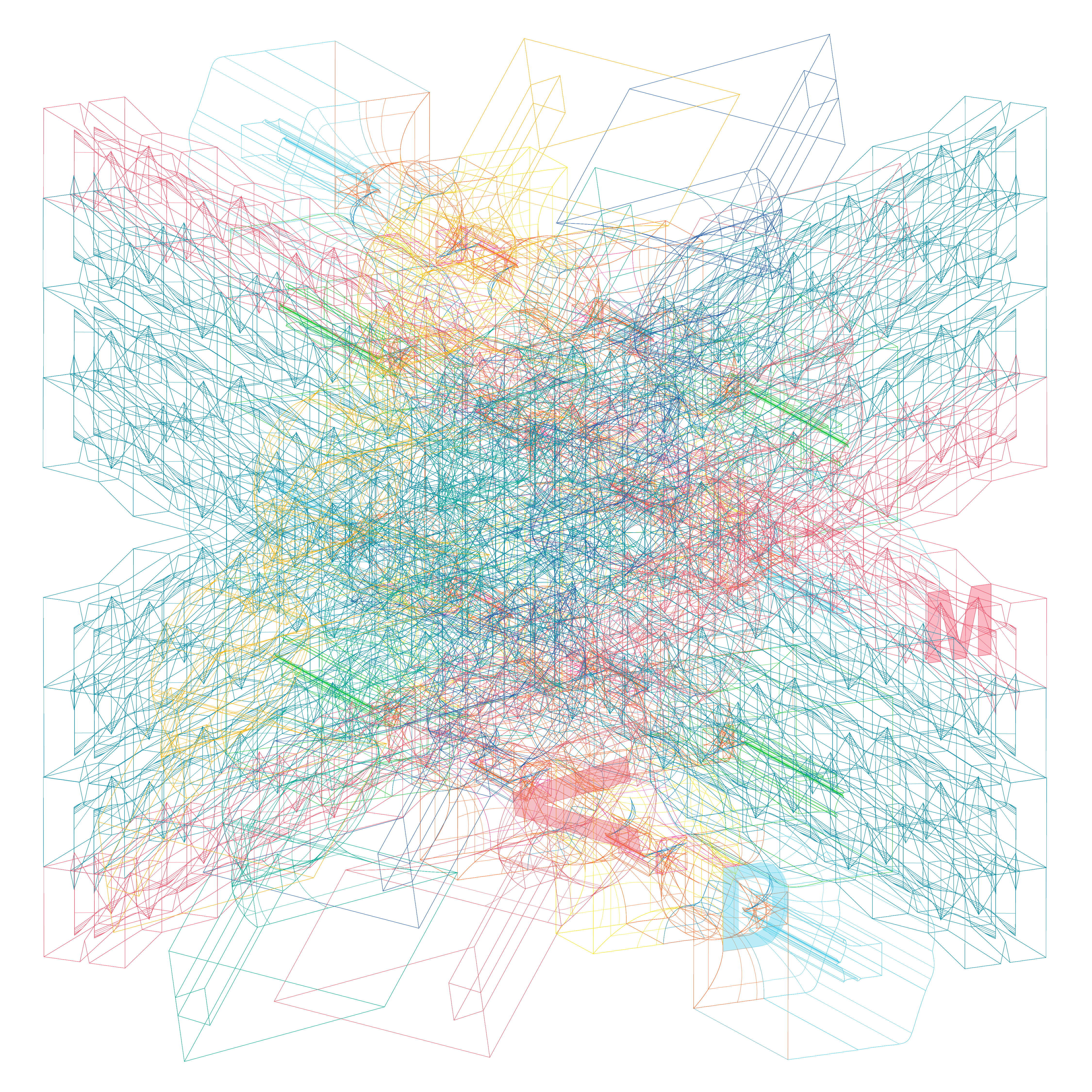
Atec Inc. / Energy Company
Being in the industry for 64 years, Atec Inc. is a manufacturing company that provides high-quality products and energy services for aerospace companies such as NASA. Atec is a parent company of three subsidiaries: Celtech Corp., Hager Machine & Tool, and Vital Link.
Today, as the aerospace industry grows, numerous projects related to jet propulsion also grow. With this thriving trend, Atec wants to grow its manufacturing size along with a number of future clients. In order to successfully connect with Atec’s potential clients, it is crucial to have progressive ways of communication. One of them is the visual language of the company’s brand value.
Recently, Atec and its three subsidiaries are going through the major reconstruction of their brand identity. As the launching promotion to Atec’s newly designed brand identity, logo animation is a mandatory presentation to the audience. Along with the newly designed logo, the logo animation should strongly deliver the company’s professional values and leave the audience with a memorable visual impression.
branding / logo animation


Communication Design Project @ SVA / Labour - Ryan Dunn and Wyeth Hansen
WATT / Energy Installation
What if we can make this nature harming process shorter with available technology? What if we can produce electricity by ourselves? We create free energy every day: walking which is our kinetic energy. What if we can convert this free energy into usable electricity. New York City has the highest pedestrian traffic rate in the world. What if 8.5 million New Yorkers walk for this free energy? What if friends can send each other watts?
Watt is a system that absorbs pedestrians’ kinetic energy which converts into usable electricity. By installing piezoelectric sensors under floors or planes where they have in contact with pedestrians’ feet, electricity can be collected and be used for any objects that require electricity. Everything.
Piezoelectricity is the appearance of voltage across the sides of a crystal when one applies mechanical stress, such as pressure. When vibration or pressure is applied to the piezo sensor, voltage is created. This created voltage can be stored in Watt captivator or as known as the battery, then be sent to units through pre-existing channels. Batteries connected to Watt tiles can be installed into any structures ranging from an apartment unit to the most populated Grand Central Station lobby to even the outdoor sidewalks.
branding / product design

Communication Design Project @ SVA / Labour - Ryan Dunn and Wyeth Hansen
Hyphen Press / Publisher
Hyphen Press is a London publisher of books on design and typography. This awesome was founded by Robin Kinross in 1980. It has produced about thirty-five books on a diverse range of topics, but most important publications are devoted to the topic of typography. The goal was to rebrand its identity and create a poster that shows all of Hyphen Press published books.
branding / information design

Branding Exploration @ SVA / Pentagram - Paula Scher & Courtney Gooch
Tengoku Ramen Bar / Restaurant
Tengoku Ramen Bar, located in Los Angeles, is a traditional Japanese ramen restaurant chain. The goal was to rebrand its identity by entirely different look and feel.
branding / logo design
Tengoku Ramen Bar, located in Los Angeles, is a traditional Japanese ramen restaurant chain. The goal was to rebrand its identity by entirely different look and feel.
branding / logo design

Branding Exploration @ SVA / Pentagram - Paula Scher & Courtney Gooch
Lark / Transportation
A Lark is a drone operated transportation company. Real company launch in 2030. Please call me if you want to invest in Lark. I won’t get on the drones.
branding / product design
A Lark is a drone operated transportation company. Real company launch in 2030. Please call me if you want to invest in Lark. I won’t get on the drones.
branding / product design


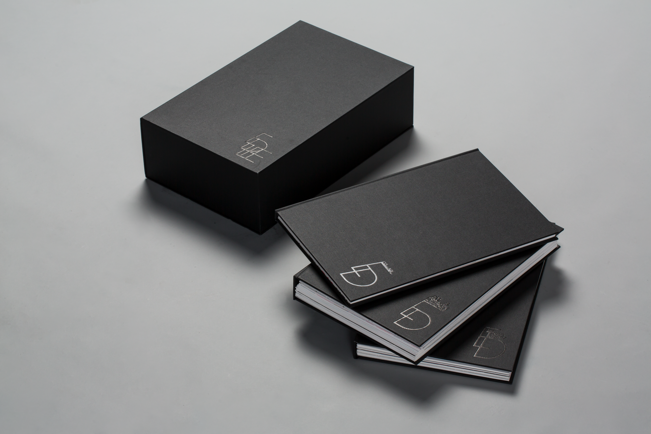
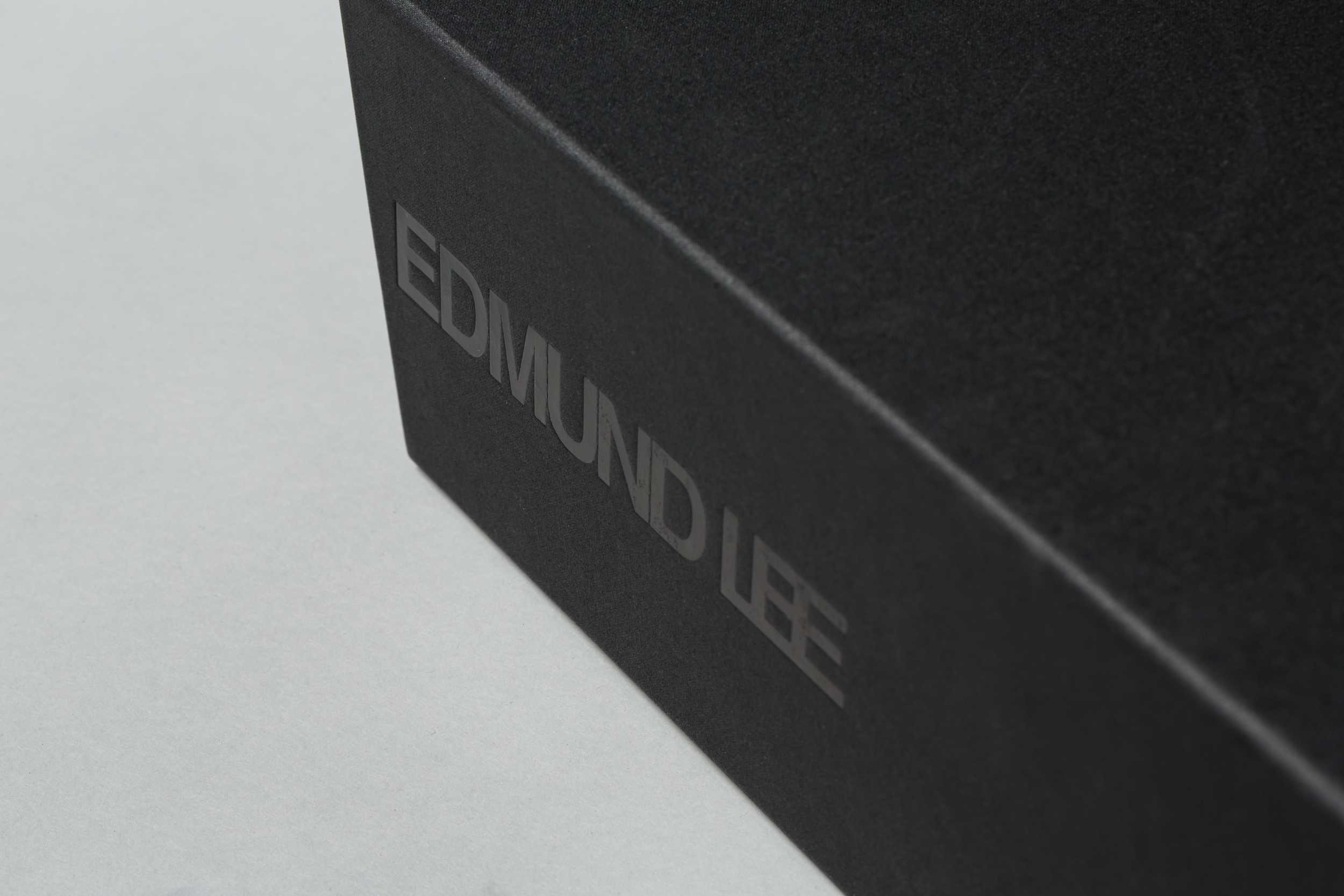
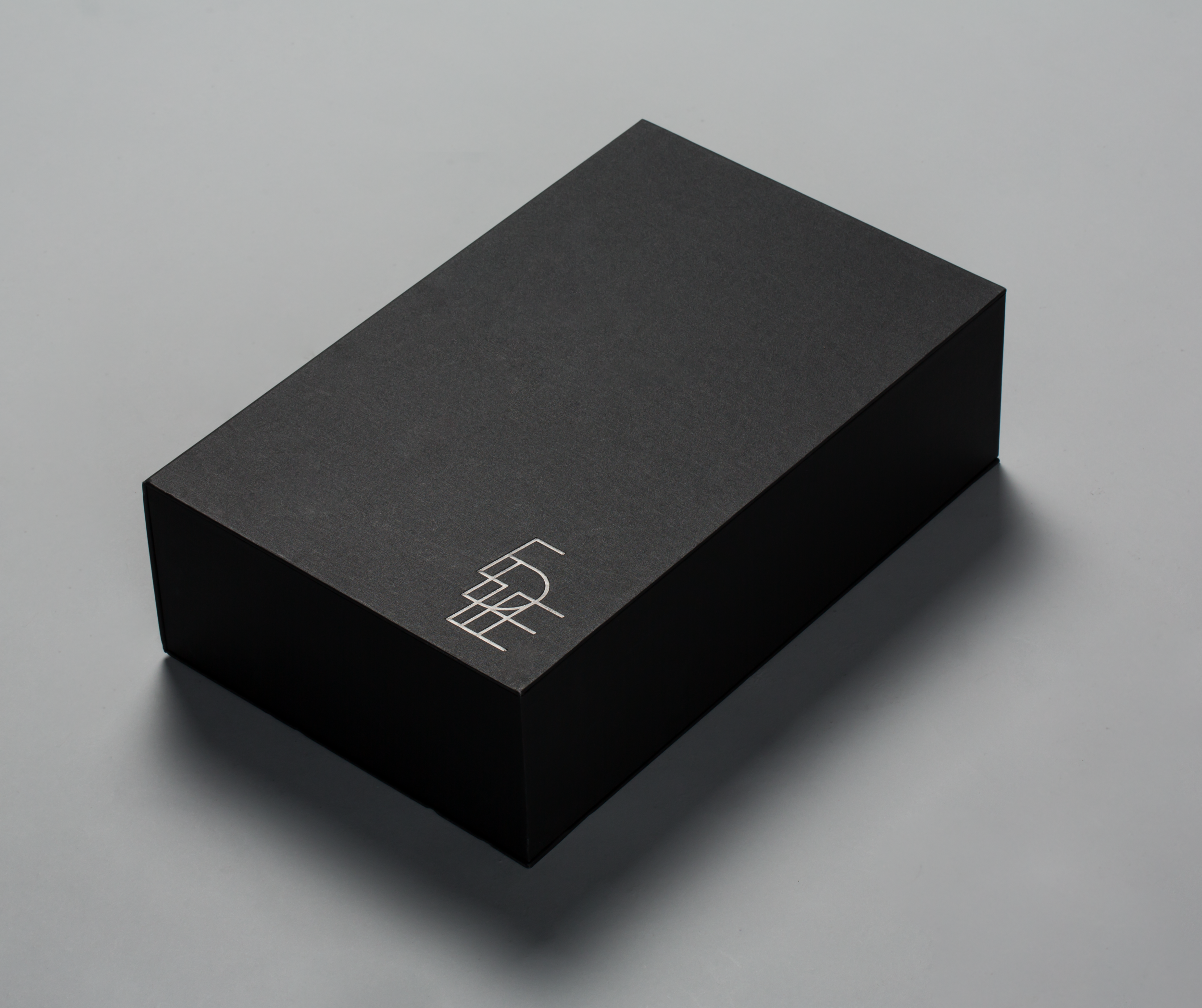
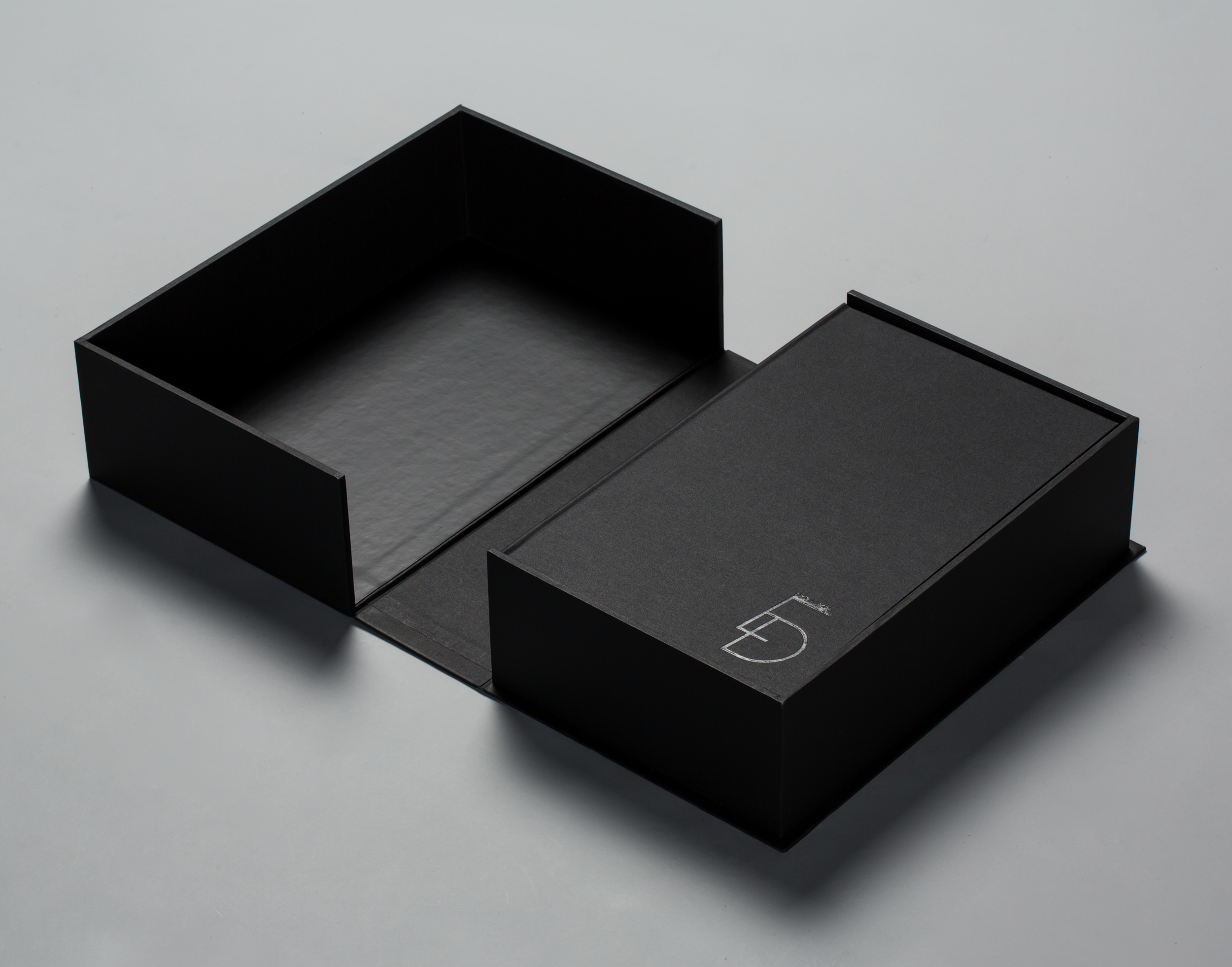
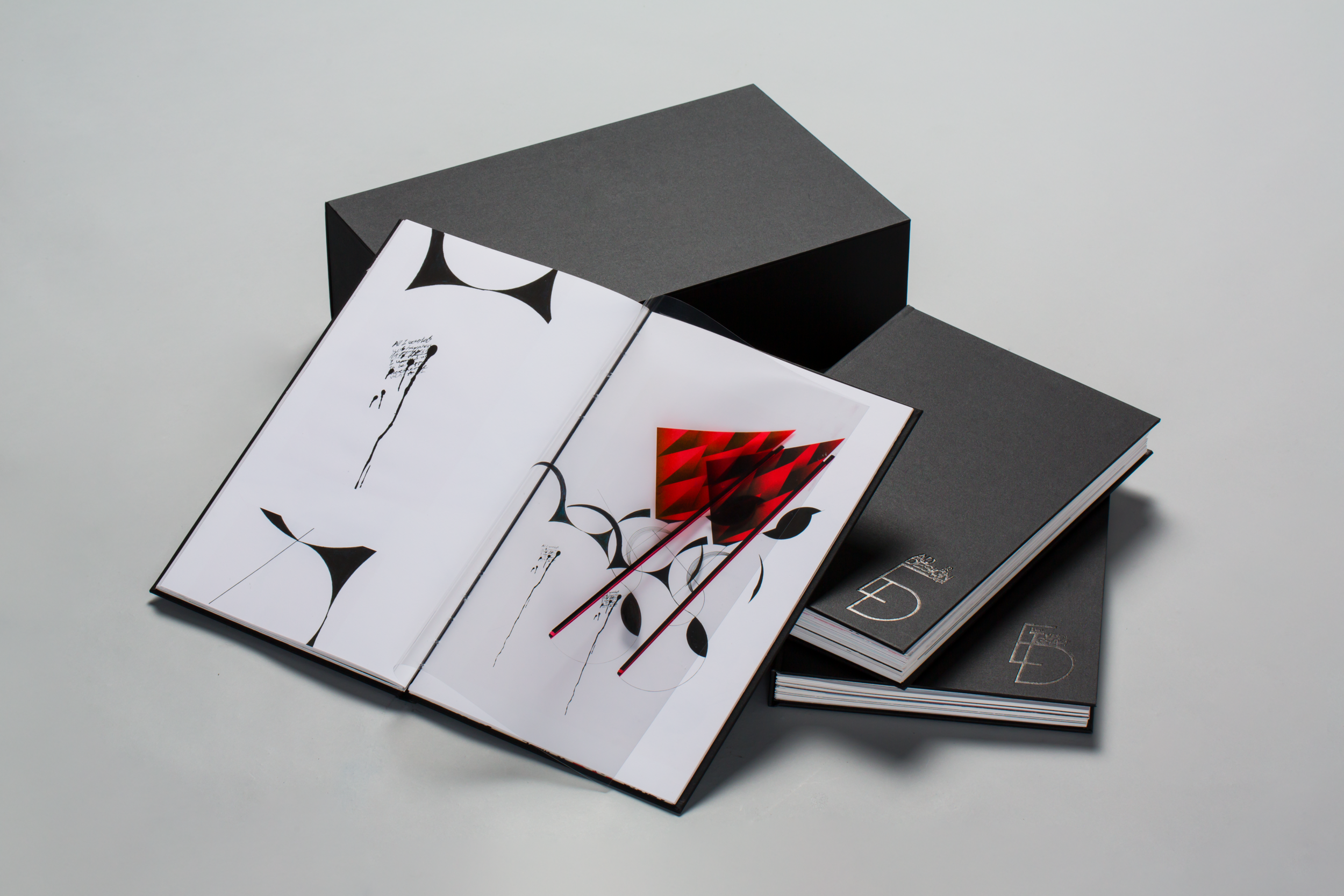
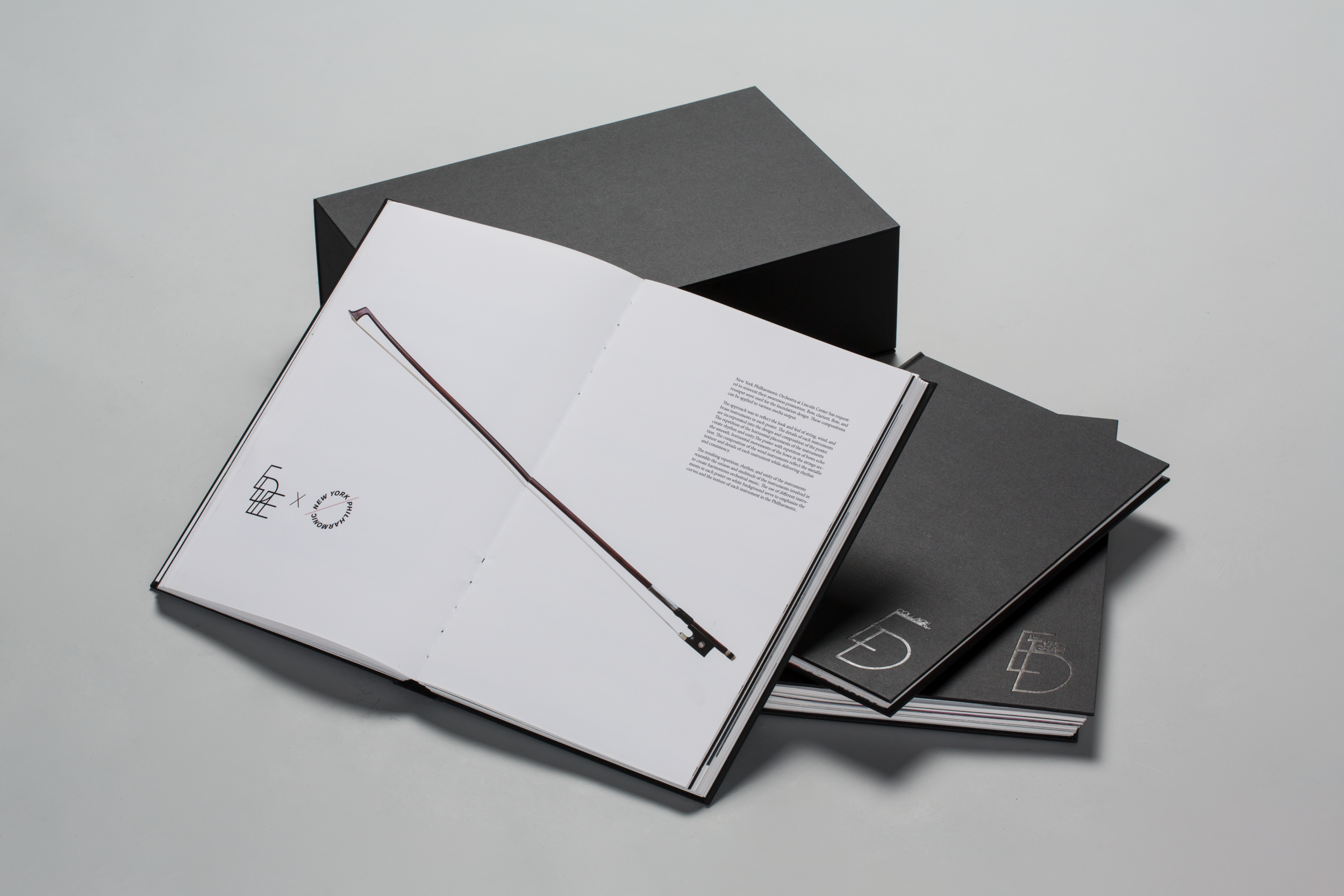
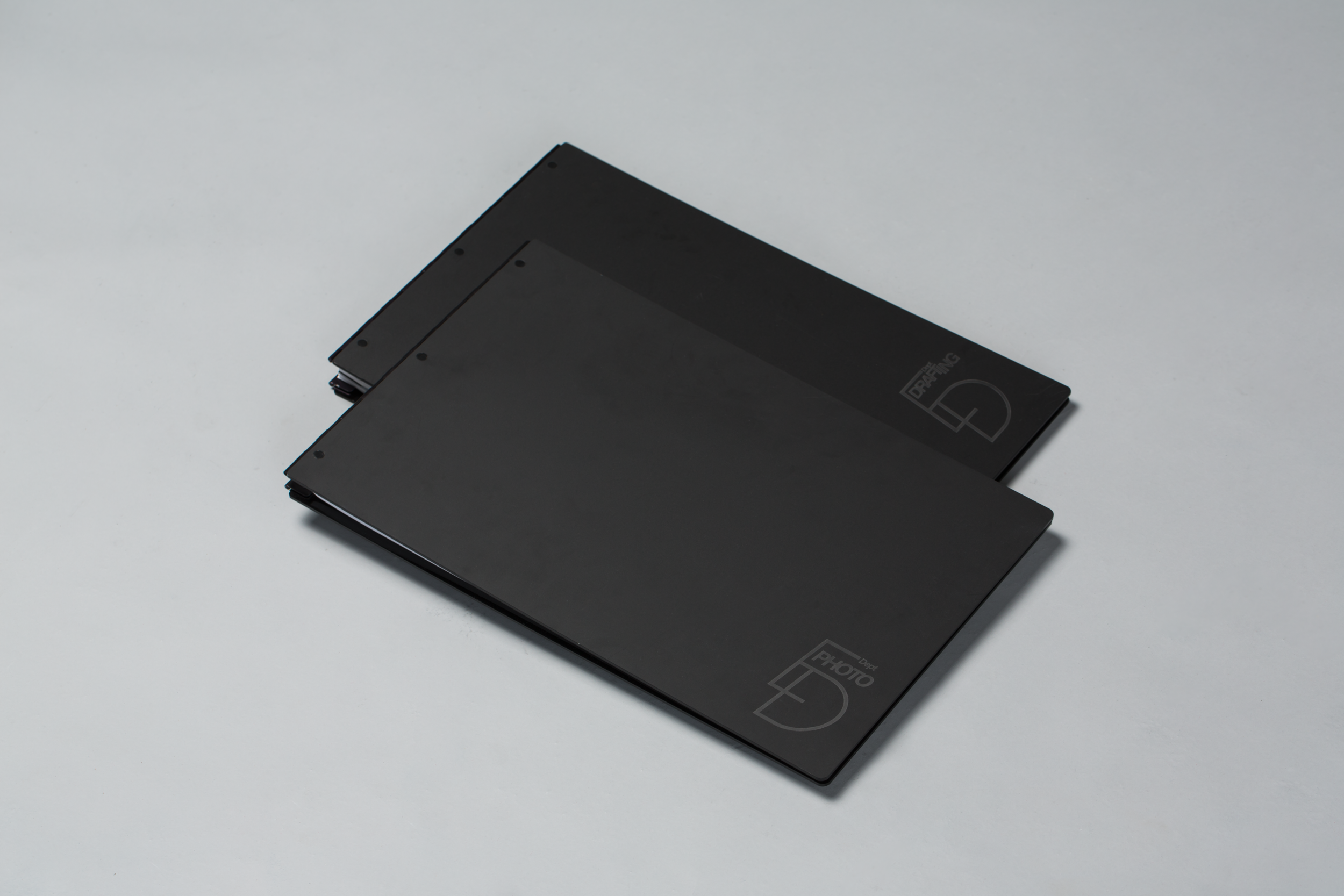
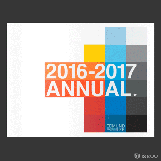
Junior Portfolio @ SVA
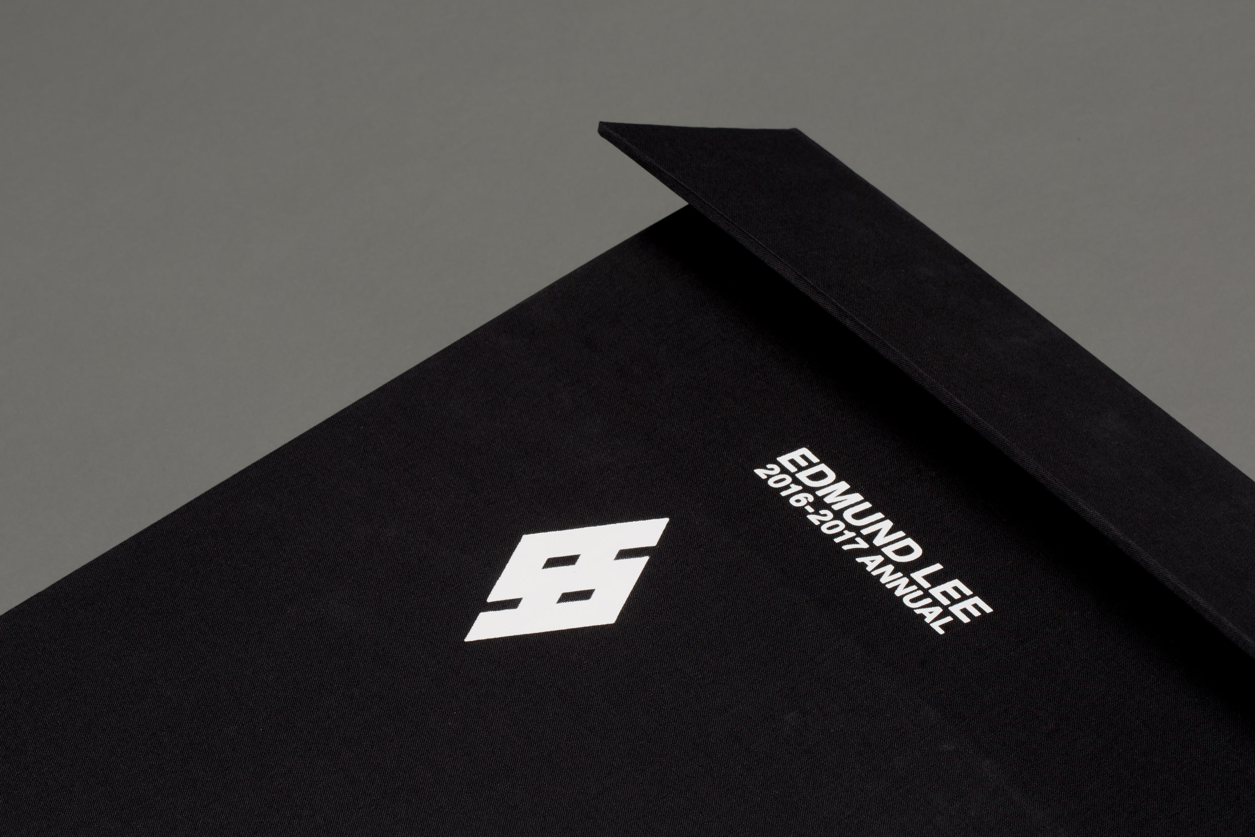
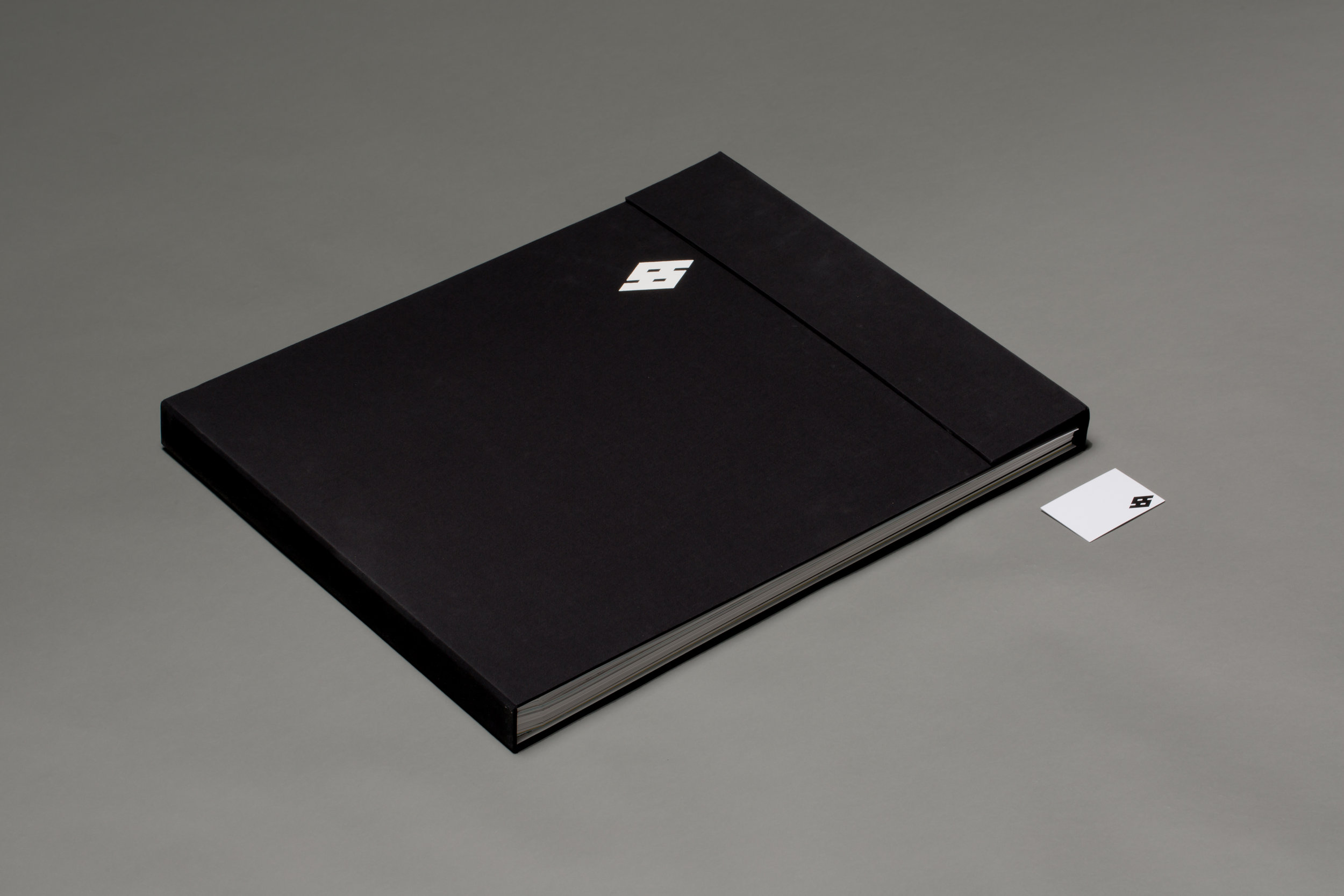
SVA Junior Year 2016-2017 / Portfolio
Collection of Junior year work that saved my ass when getting a job.
editorial design / book making / self-identity
Collection of Junior year work that saved my ass when getting a job.
editorial design / book making / self-identity
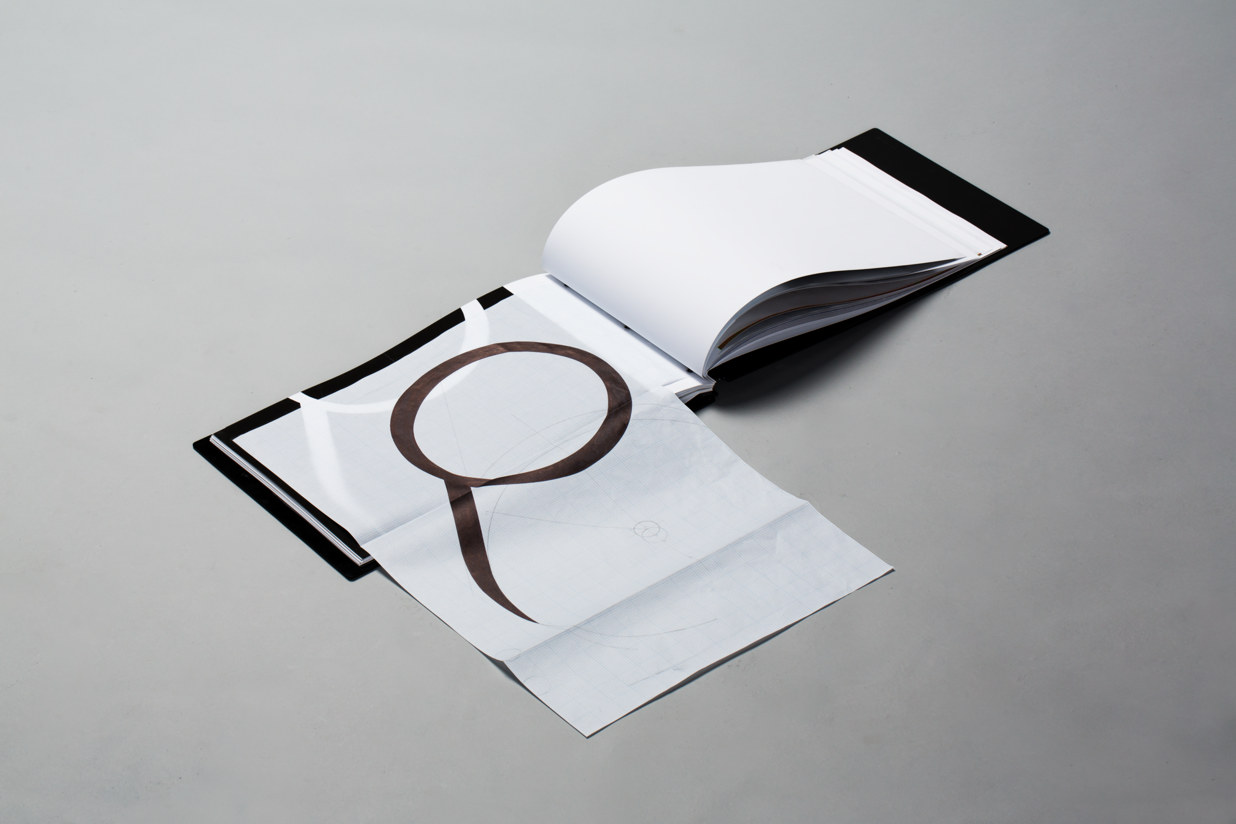
Sophomore Portfolio @ SVA
SVA Sophomore Year 2015-2016 / Portfolio
Collection of Sophomore year work.
editorial design / book making / self-identity
Collection of Sophomore year work.
editorial design / book making / self-identity